A few years ago we published a post examining the point of interest (POI) icons within Apple Maps titled More Than You Ever Wanted to Know About Apple’s Spotlight Location Icons. POI icons have existed in Apple Maps since Google was the maps provider. But with iOS 6, Apple took full ownership of Maps and introduced a selectable, color-coded POI system with all new iconography.
We took particular notice of the icons included with iOS 8 when Apple began using larger versions of these icons at the system level as part of their new Spotlight search feature. Apple has continued to iterate on these icons and has made several additions and refinements. With iOS 10 for example, Apple redesigned the Maps app to use the larger POI icon set directly on the map itself. This post will examine how the system has grown and evolved over the past few years.
Why go to the trouble?
Our interest in the Apple Maps iconography is rooted primarily in our fascination with large icon sets and the challenges involved in creating a cohesive collection. Apple’s icon set for Maps isn’t readily available and had to be tracked down individually, which only added to our interest. Finding new icons — literally spread all over the world — became a scavenger hunt of sorts. (Think of it as an advanced game of Pokemon Go.) As new icons were added and icons and colors changed, examining these revisions and additions further fueled our interest.

We’re also hyperaware of the fleeting nature of our work. Because of this, creating some sort of documentation/historical archive for this icon set interested us. One of the rewards of our field is that our work has the potential to reach a mass audience. The trade-off however is that the shelf life for our work is often exceedingly small.
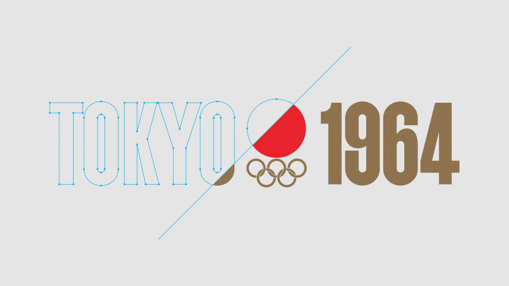
On the print side, design work is quickly discarded, forgotten and lost to decay. Little of a designer’s work is sacred. Highlighting this fact, take something as culturally significant as the Olympic games. Ben Hulse and Greg Durrell of design firm Hulse & Durrell travelled the world researching Olympic branding for past games — pouring over old artifacts and when available, graphics standards manuals — in an attempt to create as historically accurate and authentic a representation as possible of past games for the Olympic Heritage Collection. In the process they painstakingly digitally recreated emblems, mascots, and pictograms for past games, many of which had previously been recreated inaccurately and were being used incorrectly.
You might think that in the digital world it would be easier to keep track of and archive past work. Unfortunately with digital work, archiving in a way that the work can be experienced as originally intended is often even more challenging. With print, there is a physical artifact at the end of the process that is given a fighting chance at survival. However, with digital work like websites — and especially software such as the mobile applications we develop at Mercury — once a software update is pushed live or hardware becomes obsolete, previous versions all but fade away. Apps that we created just a few short years ago have long since had their backend services disabled and no longer run on newer hardware. These applications live on now only through screenshots and the occasional video.
The ephemeral nature of software can be disheartening at times. It is not unusual to see designers repeating mistakes made in similar applications that are no longer around to actively reference. In this instance, since Apple hasn’t collected these icons and presented them in a way that they can be viewed and considered as a collection, we did.
History
Current infographic systems such as this can often be tracked back at least in some small part to the AIGA Symbol Signs that were originally designed for the U.S. Bicentennial celebrations. Apple’s POI icons are no exception. The AIGA Symbol Signs, a set of 34 symbols designed by Roger Cook and Don Shanosky and commissioned by the AIGA and the U.S. Department of Transportation, were originally released in 1974 (expanded to 50 icons in 1979 and 55 icons in 1985) and were produced because as AIGA states, “While effective individual symbols had been designed, there was no system of signs that communicated the required range of complex messages, addressed people of different ages and cultures and were clearly legible at a distance.”
Apple’s icon set references almost half of the AIGA Symbol Signs in the POI system. Most of the icons are almost one-to-one, with the most signifiant changes being a Ferry with more windows and less waves, the removal of the sash and passport perspective for Immigration, and a less crowded Elevator.

If you are interested in learning more about the history of the AIGA Symbol Signs, Atlas Obscura wrote about the symbols in detail in 2015, noting that the original nursery symbol (a baby bottle) drew complaints from nursing mothers, prompting a change to the “Helvetica Baby” symbol in 1979.

Additions
Since we first examined the POI icons with iOS 8, Apple has made several additions to the set in an attempt to improve Apple Maps usefulness and more accurately represent human interest. There was a fairly significant number of new icons added with iOS 9 (37) with fewer additions for iOS 10 (17) and iOS 11 (7). Primarily because of the newly added ability to zoom in to airport terminal interiors, iOS 12 saw an uptick with 27 new icons. Disclaimer: It’s possible that some of the icons we’re noting as new at particular system levels were available earlier, and we didn’t discover them until a later version of iOS.


Consolidations
With over 150 icons in a set that spans multiple OS updates and likely several team changes, it’s not surprising to see some category redundancy. Several of these redundancies have been eliminated over the years, but a few still remain.
To be clear, I’m not referring to localized icon changes like Banks, Hospitals, Military Facilities, Police Stations, Post Offices or Japan’s localized set that also includes special icons to represent Castles, Schools, and more. As noted in our previous post, there is even a special Zoo icon in China that uses a panda—considered internationally as the national symbol for the country—instead of an elephant. And in Brazil, the Bars and Lounges Martini icon is replaced with a Caipirinha, their national cocktail. The remaining duplicate icons are mundane color variations.


Many of the icons that were consolidated in iOS 9 were beta explorations of search category quick links that were eventually adjusted to use existing icons.


Subtractions
A handful of categories have been eliminated over the years as well. Some Japanese-specific identifiers for government locations have been removed, as well as mountains, heliports, toll gates, and more.


Revisions
The overall style for the POI icons has been generally consistent since iOS 9 when the set saw an extensive redraw. Since then, however, several icons have continued to see refinement. For instance, the Aquarium dolphin which was given a smile and fin shadow inset in iOS 9, was reverted back to the previous, more simplified icon by iOS 10. One of the icons to see the most revision is the lowly Bakery croissant that has seen four stages of simplification and refinement over the years.


Though we can critique the icons as designers and communicators, we are not iconographers ourselves. To get an expert’s take, we turned to Scott Dunlap to share his thoughts. In comparing the iOS 9 set to some of the revisions seen in iOS 10 and up Scott said:
“The old versions were fine, but many of the new icons reduce ambiguity or are stylistically stronger. For instance, at small sizes the Toll Gate icon could be mistaken for a gas pump. The Ski Resort icon’s meaning was slightly ambiguous. Did it signify skiing, or that a ski lift is present? And the Pet Store icon’s simplification fits better with the other icons in the set.

I’d say the set’s biggest shortcoming is the decreased legibility when used at small sizes. As they get smaller many of the icons don’t hold up as well as they could, and should have simplified, bolder versions. Apple does supply different size variations, but for the most part they are very similar to their larger counterparts with minimal changes.”

Scott’s Pixi icon set, a simplified set of almost 600 icons, is a good example of the level of simplification Apple should aspire to for smaller sizes.

Color updates and categorization
We would be remiss not to note the dramatic improvements Apple has made in color categorization as well. There were almost 50 unique category colors as of iOS 8. By the iOS 9 beta period, color categories had ballooned up to 70. But by the time iOS 9 launched, Apple refined and reduced the overall color set to just 22 categories. As of iOS 12, 24 colors are used for categorization. Though some minor consolidation could still take place, the current set is a huge step in the right direction.


(Select to view full-size image)
New holding element shapes
One last change of note is the addition of holding element shape differentiators (which you likely already noticed above). As of iOS 12, Transportation icons — both vehicular and pedestrian — have been changed from the standard circle to a rounded rectangle to further help call out these important items on the map.

(Select to view full-size image)
Acknowledgements
We would like to thank Scott Dunlap for sharing his insights. Check out his work if you aren’t already familiar.
Justin O’Beirne has written some incredibly in-depth articles examining other changes and refinements to Apple Maps and how it compares to Google Maps priorities and decision making.
And thanks to everyone who has reached out to share additional icons that we hadn’t discovered. Michael Giskin deserves special credit for the numerous icons he has made us aware of.
