A few weeks ago, Google added a new navigation pattern called Bottom Navigation to their Material Design guidelines. This form of navigation, according to Google, allows users to quickly move between three to five top-level destinations of similar importance on smaller, mobile screens. They present it as a navigation alternative to the persistent navigation drawer and app bar-anchored tabs prevalent in many Android apps, and recommend it for:
- Frequent switching between views
- Apps with few top-level views
- Promoting awareness of alternative views
- Mobile devices, as bottom navigation is located in a more ergonomic location
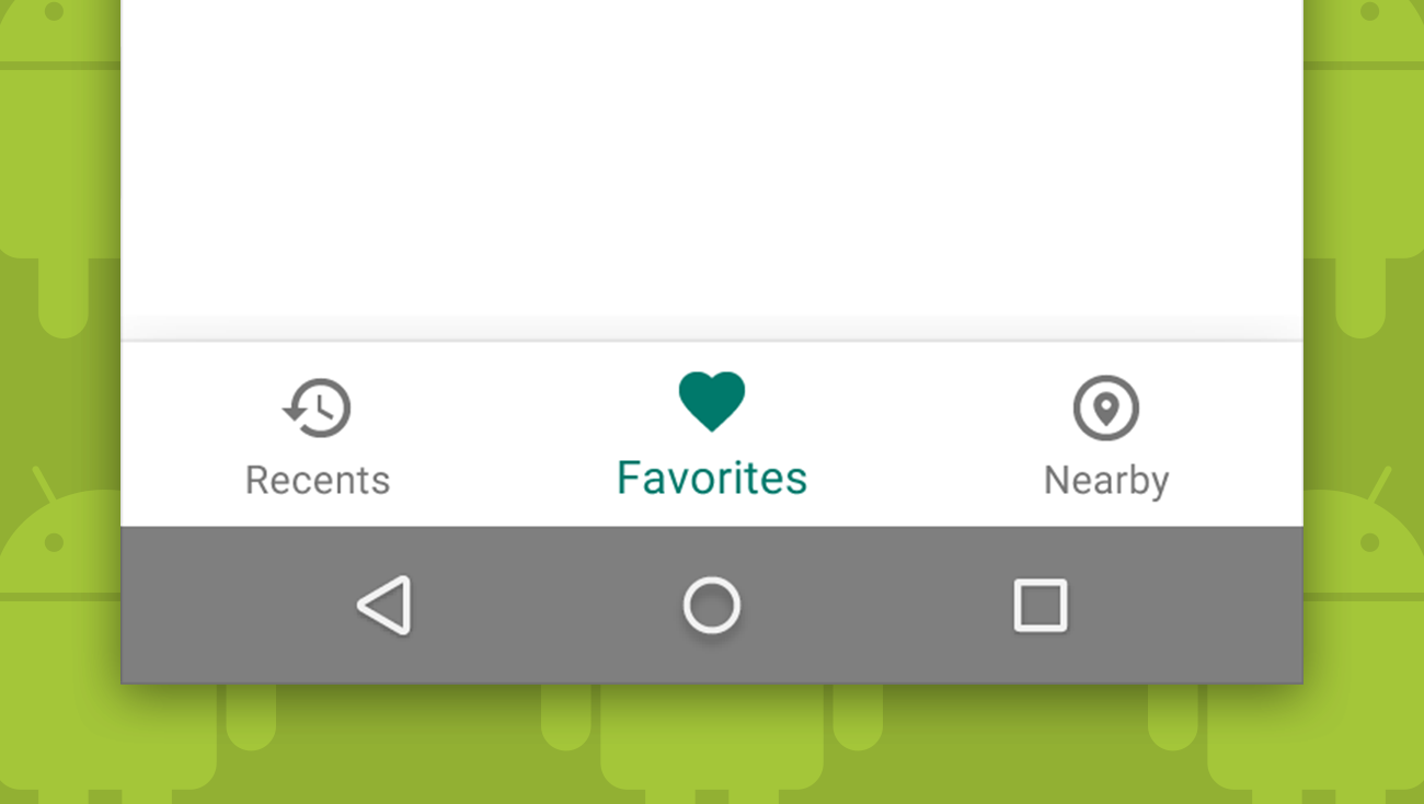
Bottom Navigation in action
Over the last month, we have seen Google introduce the Bottom Navigation pattern in the Google+ and Google Photos apps. In both places, Google is using the Bottom Navigation bar for three to four of the primary sections and a Navigation Drawer (a.k.a. hamburger menu) to catch everything else. While neither of these implementations follow the guidelines Google recently introduced to the letter, we imagine that they were testing receptiveness and analytics for this navigational approach before making it official.

It only makes sense that Google would want to create more alternatives to the Navigation Drawer. After all, there have been a number of tests showing that while navigational approaches like the drawer and Spinner Menus clean up the interface, tab-like navigation seems to result in far better user engagement:
- 2013: Facebook moved away from the left navigation drawer after testing a number of navigation variations on over 8 million users.
- 2014: Zeebox discovered that changing their navigation from Tabs to a Navigation Drawer on their Android application halved their engagement time.
- 2015: Polar replaced their Segmented Control/Tabs with a Toggle/Drop Down/Spinner menu on iOS, and saw daily engagement plummet.
The iOS way
On iOS, Android’s primary competing platform the Tab Bar has been one of Apple’s preferred navigation approaches since the platform first launched in 2007. Like Google’s new Bottom Navigation approach, Apple’s Tab Bar interface is located at the bottom of the screen and is recommended for apps with two to five sections. Apple recommends the Tab Bar over other navigation approaches for primary navigation because of its ergonomic location of primary controls and clear exposure to navigation choices.

Google’s Bottom Navigation is not, however, a direct copy of iOS’s Tab Bar. Google recommends a number of things that Apple does not:
- Hiding Bottom Navigation on scroll: Apple never hides a Tab Bar on scroll.
- Using App Bar Tabs OR Bottom Navigation, but not both: Apple allows the use of Segmented Controllers and the Tab Bar together.
- Enlargement of the selected tab: Apple’s Tab Bar is static other than colorization of the active tab.
- Icons without persistent labels: Google has a design that allows a label to only appear on the selected tab, whereas Apple always includes labels in its Tab Bar.
Android’s former stance
In the past, Android specifically advised against the use of bottom tab bars to further differentiate their UI from Apple’s. This screenshot was taken from Google’s Developer Design Guidelines in February 2016:
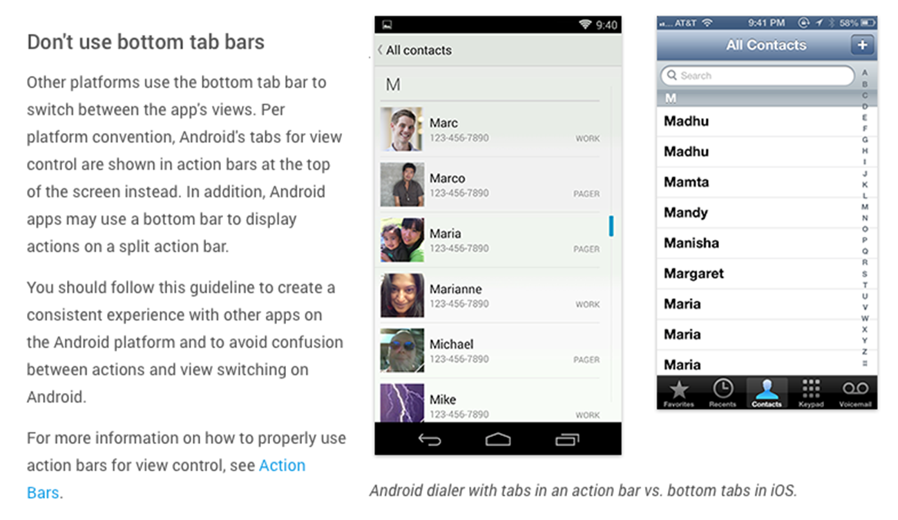
Early Android devices had Back, Home and Overview buttons as a part of their physical device. As the Android platform matured, the Android Navigation Bar was introduced at the bottom of the screen to replace these hardware buttons. This shift created a new concern that stacking primary navigation controls directly on top of these system controls would lead to errant taps that could cause the user to close an app or go back when they intended to switch sections. We accepted this as a solid reason to not use bottom tab bars on Android and proceeded to design and build Android apps using other navigational patterns.
To tab or not to tab?
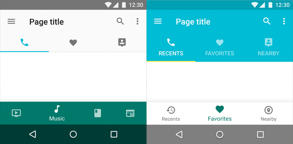
Tabs that appear at the top of the screen, directly under the app bar, have been a navigation pattern on Android since 2010. Google’s guidelines for tabs allow for many different variations and make them a fairly robust navigation pattern:
- Recommended for two or more destinations
- Text-based, icon-based with labels and icon-based without labels
- Fixed or scrollable
- Can be pinned to the top of the screen
- Swipe-able (my favorite thing about them because it negates the fact that they aren’t in an ergonomic location)
Bottom Navigation has not replaced tabs—they can be very similar visually—but are very different in interaction and placement:
- Recommended for three to five top-level destinations
- Icon-based with labels or icon-based without labels
- Always fixed
- Can be pinned to the bottom of the screen
- Not swipe-able
Google warns us not to combine Bottom Navigation with Tabs, but they do not address the potential visual confusion between the two and recommended-use overlap. YouTube, Phone, and Clock have icon-based, fixed tabs that a user can swipe between. Twitter has an icon-based Bottom Navigation bar that I can’t swipe between, despite their visual similarities.
The navigation pattern we’ve always wanted, or just another complication?
Since Android’s beginning, we have seen much exploration and experimentation around navigation patterns on the platform. Now Google has presented us with Bottom Navigation. It could be the navigation pattern we’ve been hoping for; after all, it’s a great alternative to navigation patterns that hide navigational elements under a tap, lives in an ergonomic location, and looks visually different from iOS’s Tab Bar. It could also complicate a platform that already has a Navigation Bar at the bottom of every screen and has tabs as a more established navigation pattern. As something that we’ve long been told to avoid on Android, it would be nice to have a little more explanation from Google to help us understand this change of heart.