Designing great streaming TV apps, Pt 2: Top or left navigation
In part two of our series on designing great streaming TV apps, we explore the pros and cons of top and left-hand main menu navigation.
In part two of our series on designing great streaming TV apps, we explore the pros and cons of top and left-hand main menu navigation.
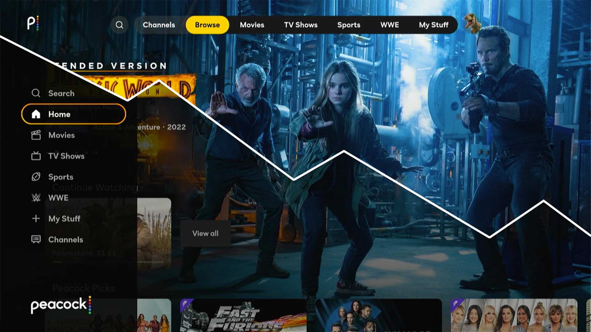
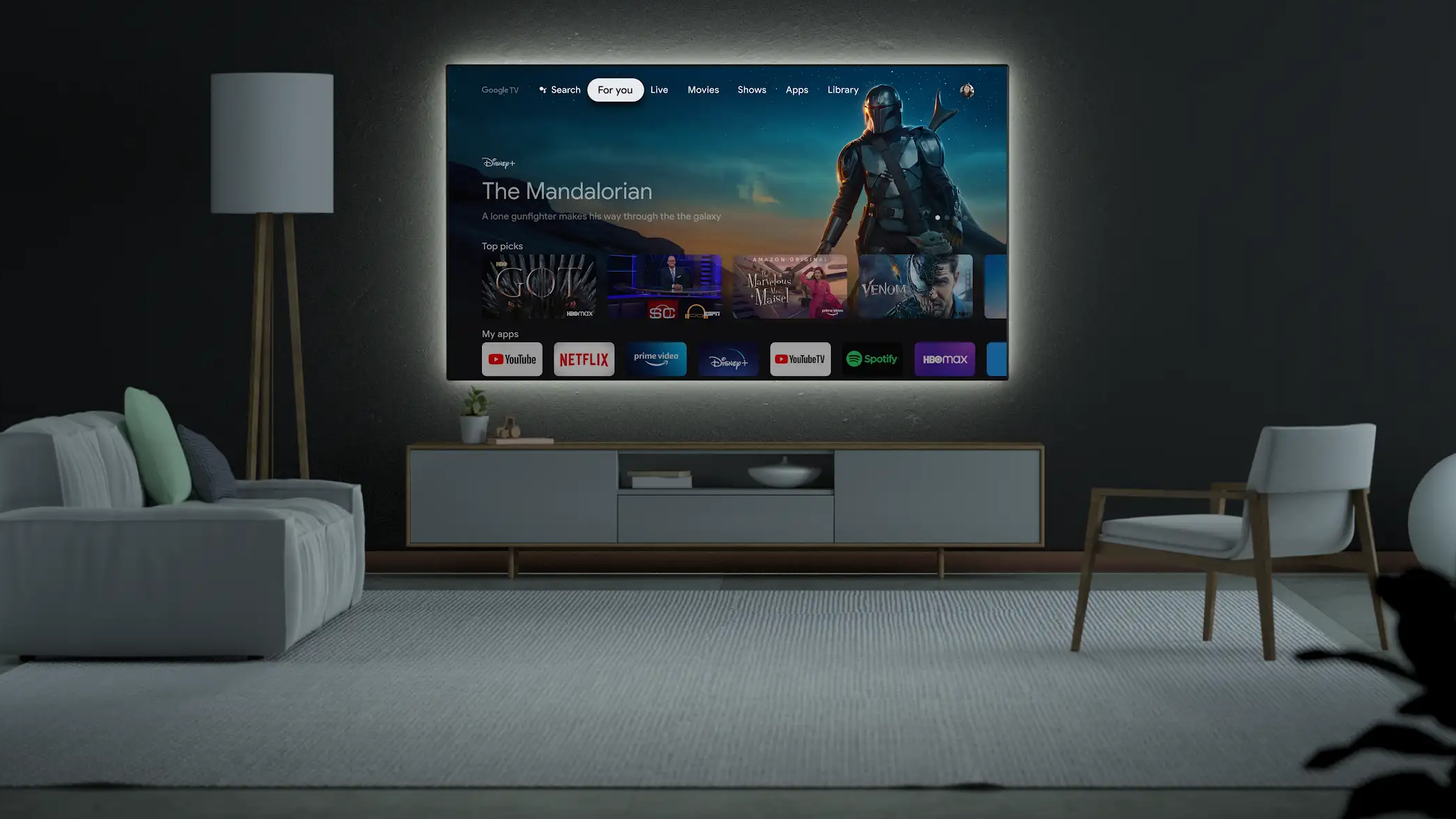
Explore the unique challenges of designing for TV, from 10-foot UI and remote control navigation to industry best practices.
A better Sketch and Figma app icon template that allows you to create, preview, and export both Android and iOS app icons quickly and easily.
An updated examination of the point of interest (POI) icons in Apple Maps reviewing additions, subtractions, and revisions from iOS 8 to iOS 12.
Discover how Apple TV screensavers could evolve through third-party apps, featuring interactive concepts from ESPN, CNN, and Red Bull TV.

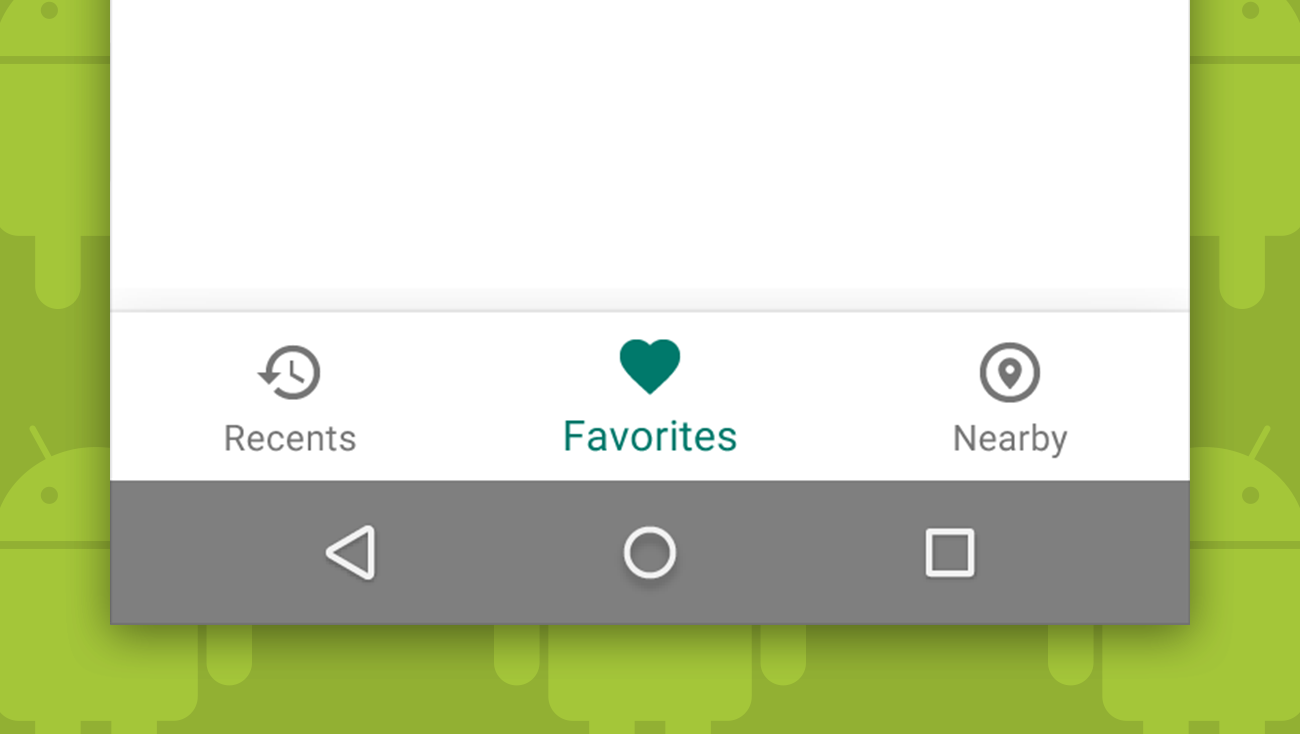
Despite Google’s history of advising against bottom navigation, they recently added it to their material design guidelines as a primary navigation pattern.
The most complete, most up-to-date, most accurate, and most thoughtfully structured iOS 9 UI kit available for Illustrator and Sketch. Absolutely free!
Some important early lessons we have learned about building Apple Watch apps.

An in-depth look at Apple’s Spotlight and Maps icons along with an examination of the breadth and harmony of the set.

Family Sharing makes the process of sharing content between family members easier and more robust, but it is still a somewhat complex feature to setup. Learn about some of the frustrations we encountered setting up Family Sharing along with a few workarounds.
