Last Friday, I had the pleasure of speaking at Renaissance, an iOS developer conference in San Francisco, about the heightened importance of animation in iOS 7 and how animation can be used to improve usability1. One of the points that I discussed briefly was the use of loading animations to indicate status.
Before I dig in, let me start by saying that the significance of load time and speed cannot be minimized. Marissa Mayer pointed out in 2006 at Web 2.0 that just a half second delay in load time resulted in a 20% drop in traffic to Google’s search page. We should all be striving to have our apps load as quickly as possible.
However, perception can be just as important as raw speed. The New York Times Sunday Review article, Why Waiting Is Torture, really brings this to light. In this article, Alex Stone discusses the psychology of waiting and notes how high levels of customer complaints at a Houston airport dropped to nothing after the airport extended the distance between the terminals and baggage claim. This forced travelers to walk six times further, but although overall wait time increased, the occupied time of walking felt shorter than the unoccupied time associated with standing around at the baggage carousel.
It was from this perspective that I noted that custom loading animations can be valuable to distract and entertain your users while content is retrieved. But I also noted a word of warning.
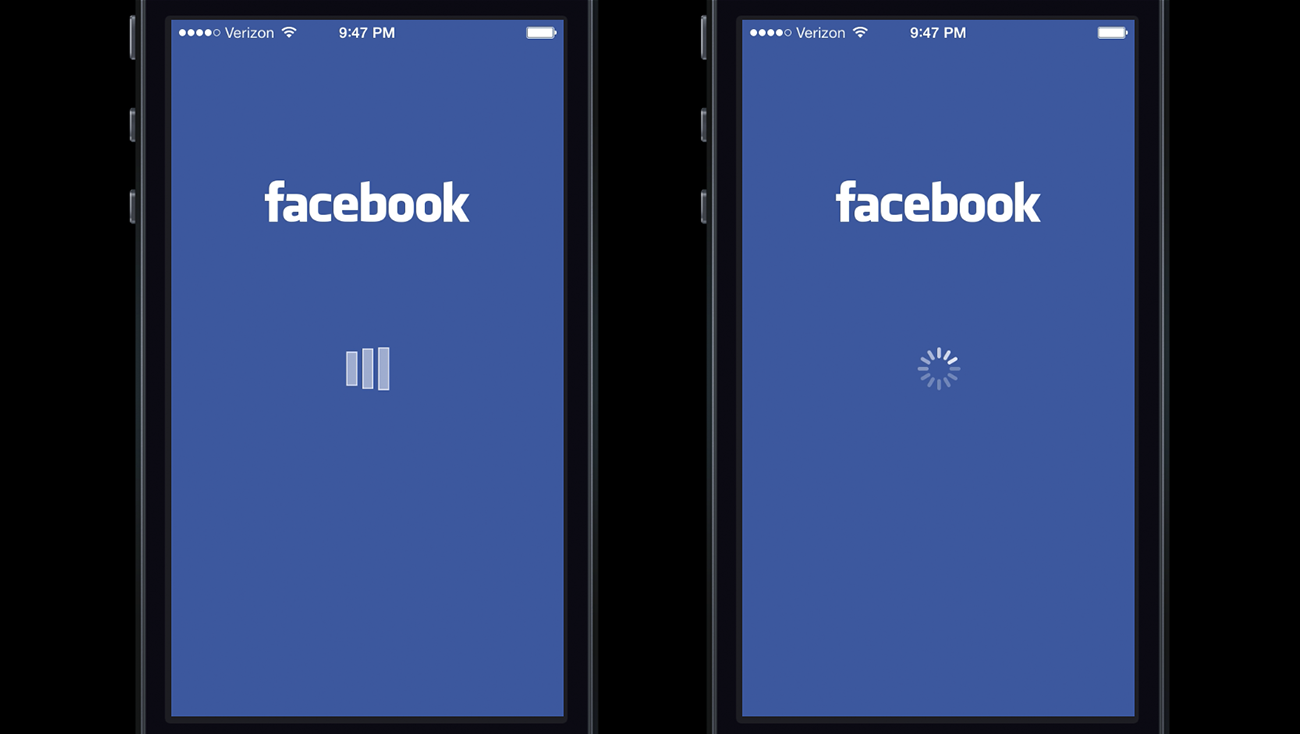
This warning pertained to a Facebook test indicating that when their users were presented with a custom loading animation in the Facebook iOS app (left) they blamed the app for the delay. But when users were shown the iOS system spinner (right), they were more likely to blame the system itself.


The slide about this, which appears at the top of this post, was tweeted out during my talk and sparked a lot of conversation (over 4,500 retweets). Several people were interested in learning more about the source of this information and how the results were gathered. My source is a July 2013 tweet from Flipboard engineer, Raphael Schaad. Last year, Raphael tweeted:
Raphael later followed up by noting that the source of the information was an A/B test relayed to him via a discussion with one of Facebook’s designers2.
While I was able to track down the source of this info, they are no longer with Facebook and are not at liberty to provide additional information. I also attempted to contact Facebook Director of Product Design, Julie Zhuo because of her previous openness to share Facebook’s process with the design community. Since I have no personal connection to her, it is unsurprising that she didn’t respond to my Twitter and Facebook messages. Although I wasn’t able to reach her, Julie did write a good post highlighting some common pitfalls of A/B Tests titled The Agony and Ecstasy of Building with Data that is worth a read.
Clearly there is a lot of interest around Facebook’s findings, and I wish I had the rest of the story to share. I have a lot of respect for the work that Facebook’s iOS team has done over the years. Stretching all the way back to Joe Hewitt’s time overseeing the launch of the initial iPhone app to this week’s launch of Facebook Paper, Facebook has been one of the most consistently innovative and experimental developers on iOS.
The main take away here is that even though short load times are important, loading animations can sometimes be helpful to divert user’s attention. And although custom animations can be especially powerful at doing this, when load times are incredibly long or outside of our control, it might be a good time to use the standard spinner and share some of the blame with the system.
1 If you are interested in checking out my animation talk, I encourage you to download the Keynote file or PDF of my slides. These files include presenter notes and additional links. The Keynote file is best viewed in Keynote ’09 and notes can be viewed by activating Presenter Notes in the View menu.
2 Some people have been confused and frustrated by the reference in shared tweets that this information came from A/B testing. Twitter iOS engineer, Nick Takayama was especially bothered and may be right that it was a qualitative test used by Facebook to come to these results. I stuck with the A/B reference, since it was the language Raphael used, and I didn’t have more to go on.


