This is the second in a series of posts on designing the streaming TV app experience. Our first post was an introduction establishing that we plan to explore inconsistencies and overlooked details in streaming TV apps. We contend that because many users interact with several streaming apps and access those apps across multiple streaming platforms, ignoring these details places even more of a burden on the user than normal stand-alone app scenarios might.
This is our first deep dive, and we will start by looking at one of the first things a user interacts with in a streaming TV app: the main menu. Virtually all streaming TV apps use either a top navigation approach or left-hand navigation for their main menu. In this post we will examine the pros and cons of the two approaches, explore some implementation inconsistencies in each, and share our design recommendations.
A quick note…
We realize that at times we can come across as overly critical of the applications we are reviewing. We hope none of the designers or teams involved in working on these apps feel called out or threatened by us noting various design issues and concerns. There are lots of reasons why design and user experience issues can occur. Some are our responsibility as designers and product owners, but some are dictated by timelines and limitations that are outside of our control. We state this mainly to say that we are not beyond having similar issues in apps we have worked on. Software never ships bug-free, and the best apps are always evolving and improving. Our goal is not to shame, but to learn and grow.
App research
In our previous post we mentioned that we recently reviewed twenty-five streaming applications across the top six streaming platforms in the US (Roku, Fire TV, Samsung, Android TV, LG, Apple TV) and conducted a series of user interviews and surveys about the streaming TV experience. Below is a rundown of the applications and platforms we examined. If an app wasn’t reviewed on a particular platform, it is because it wasn’t supported on that platform when we were reviewing.
It is also worth noting that a large subset of our reference apps lean heavily towards sports. This is primarily because we tend to do a lot of work within the sports industry, so it is especially important for Mercury to understand this area of the market.
One last note before we dig in, four of the apps we reviewed (Bally Sports, NBA, Peacock, and Prime Video) switched from top to left-hand navigation since we started our research. With this recent change, six of the eight paid streaming services we looked at are now using left-hand navigation, with only Apple TV and Hulu still using top nav.


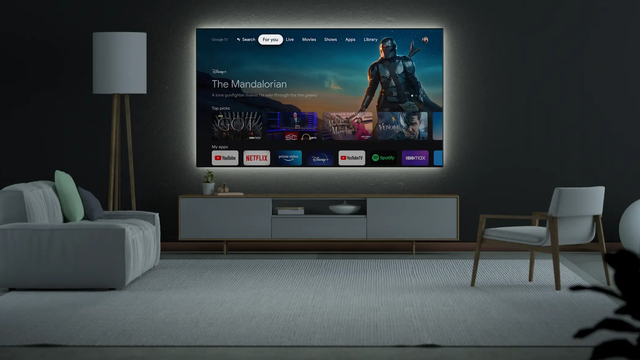
Top navigation: The more common approach
Top navigation is used by more streaming TV applications for their main menu. At the beginning of our research, 68% of the apps we looked at were using top navigation for their primary nav. With Bally Sports, NBA, Peacock, and Prime Videos’ recent switch to left-hand nav, top and left-hand navigation are 50/50 when looking at the applications we reviewed. However, top navigation is still currently slightly more prevalent across all streaming apps.
Pros
Clear initial menu presentation and position: One key advantage of top navigation apps is that the full menu is clearly presented when first opening the app. The menu is also positioned at the top of the screen, a position familiar to computer users and most website navigation on larger devices.
Takes up less space when menu is presented: When the navigation is presented at the top of the screen, it takes up far less space than the expanded left-hand nav. As a bonus, the user can more clearly see and interact with the content while the menu is present.
Easy to implement: Top navigation apps can be moderately easier to develop. Left-hand navigation isn’t necessarily always harder, but there are transitional animations sometimes incorporated as the menu slides out that require a bit more polish and attention to detail. See the “Potentially more complex to implement” area under left-hand navigation cons below for examples.
One related note, even though some of the platforms provide stock development components for top navigation, they are typically pretty limited in how they can be customized. If you plan to customize the look and feel or behavior of your main navigation at all, it will likely require custom development work.
Cons
Quick menu access is less clear/convenient: In an informal survey we conducted of streaming TV app users, several people mentioned that they preferred left-hand navigation to top nav mainly because it is too difficult to get back to the main menu when scrolled down in top navigation apps. Users who noted not being able to easily access the main menu in top navigation apps after scrolling down through rows of content either struggled to change context by selecting another button rather than pressing or swiping up to reverse course or didn’t realize that selecting the Menu/Back button on the remote is intended to automatically scroll back to the top of the section to make accessing the main menu easier.
This “scroll back” behavior is fairly common in all of the streaming platforms we reviewed, especially for apps that utilize top navigation. So why isn’t pressing Menu/Back to return to the main menu on top nav apps better understood?
First, pressing Back to return to the main menu isn’t obvious. And it’s worth pointing out that Apple TV is the only platform that ever featured a Menu button instead of a Back button. All other platforms adopted a Back button on their standard platform remotes instead. And in May of 2021, after 14 years on the market, Apple relented and changed their Menu button to a Back button as well with the fifth iteration of the Apple TV remote, the second generation Siri remote.


Second, the platforms don’t properly educate their users that they can press Menu/Back to quickly return to the menu. Apple TV isn’t the only platform to implement this behavior. Fire TV and Android TV both have top menus at the system level that the user can navigate back to via the Back button when scrolled down in rows of content.
Many behaviors and gestures on TV as well as our mobile touch-based devices are “hidden” and require some training and education. When it comes to touch devices, Apple, Google, the device manufacturers, and the network providers did a lot of the heavy lifting in educating users about the basic gestures and functionality through years of extensive advertising that taught users how to interact with these new devices as well as what was possible on them, all while selling people on why they should want one for themselves.
Early adopters, excited to show off their new devices as a status symbol, were also more than happy to pick up where advertising left off and demonstrate how their new devices worked. This education through advertising and shared user knowledge hasn’t translated well to TV devices.
Because the market for streaming TV devices is smaller compared to mobile devices and the hardware revenue isn’t as great, advertising isn’t as extensive. And when a platform does advertise, the important thing to sell is not how it works, but the applications and content the user can access on it.
Likewise, shared knowledge isn’t as great because unlike mobile devices which are always with us and easy to show to someone else, streaming TV devices are tethered to our homes. If a user is streaming content from their TV with a guest, they are likely to control the experience with the platform remote, leaving the guest as a passive content observer with their eyes fixed on the TV instead of the user and the remote.
Finally and worst of all, seven of the seventeen apps we reviewed that used top navigation implemented the scroll back behavior inconsistently across platforms and one other app didn’t implement the behavior on any of their supported platforms. See the chart below for apps we documented with inconsistent or no scroll back behavior.
When a behavior varies across platforms like this, the first thing we ask ourselves is whether this is a deliberate change or an oversight. In this instance we suspect the inconsistencies are an oversight.
Bear in mind that the scroll back behavior isn’t perfect. There is a risk of the user selecting Menu/Back unintentionally and losing their place, but we feel the trade off is worth the potential risk. And as we’ve stated previously, it’s important to remain consistent with expected platform behaviors.
Other inconsistencies
Sections load on focus vs on select: Apps that use top navigation for their main menu tend to load their sections on focus instead of requiring the user to press a button on their remote to confirm selection. Of the seventeen apps we reviewed that use top navigation, only 18% required a press to load their sections. 47% of the apps we looked at changed sections on focus.
The remaining 35% were inconsistent and the behavior varied based on the platform we tested. It’s difficult to say for sure whether this change across platforms is deliberate or not.
First, some of the platforms like Roku and Fire TV have older, slower hardware that is still actively supported. Load times are slower on these devices making load on focus a less desirable experience.
Second, three of the apps appear to lean towards press over focus. But two of those apps (NBA and Prime Video) have since moved away from top nav altogether and the other (NBC) only uses focus on Apple TV, which likely has more to do with the behavior of the stock top menu code on the platform than a conscious decision by the product owners.
Top navigation menu scrolls off with the content vs locking to the top of the screen: We noticed fairly inconsistent behavior in relation to the menu either scrolling off or locking to the top of the screen. 47% of the apps we tested scrolled away with the content, 29% locked to the top, and the remaining 24% exhibited inconsistent behavior.
For the apps that exhibited inconsistencies with load on focus or select it is hard to tell if the difference between platforms is deliberate or an oversight. With this issue we can assume the apps that implemented this differently across platforms failed to document the preferred behavior.
If we look at our inconsistent group (see the chart below), three of the four (MLB, NBC, and Prime Video) were clearly intended to scroll off and Hulu was intended to lock. If we lump these apps in with our other results, we have 65% scrolling off and 35% locking.
Featured content vs main menu selected on launch: When launching an application fresh, we observed that some apps would apply focus to the main menu and some would focus the featured content item. Of the seventeen apps we reviewed that support top navigation, 35% set focus on the menu on all platforms and 35% set focus on the featured content item or row. The remaining 30% presented irregular behavior across platforms, with four of those favoring the main menu and one favoring content.
Scroll back to menu behavior: Another issue we identified both in top menus that scroll off and those that don’t is inconsistency related to returning to the main menu once the user has scrolled down. In our research we documented the following behaviors when scrolling down in a section and then selecting the Menu/Back button on the remote.
Behaviors when the menu scrolls off:
- Returns to the top setting focus on the currently active section.
- Returns to the top selecting the last section the user had focus on even if it isn’t the active section.
- Returns to the top presenting the menu but applying focus to the featured content row.
- Returns to the top setting focus on the featured content row. The main menu isn’t presented.
- Presents the main menu without scrolling back to the top, focus is on the currently active section.
- Closes the application.
- Presents a confirmation menu to close the application.
Behaviors when the menu locks:
- Returns to the top selecting the currently active section.
- Returns to the top selecting the last section the user had focus on even if it isn’t the active section.
- Returns to the top presenting the menu but applying focus to the featured content row.
- Focuses the currently active section in the menu without scrolling back to the top.
- Closes the application.
One note in relation to apps that return to a locked main menu or present a menu that has scrolled off without scrolling back to the top of the current section. This behavior appears to have originated with the second and third generation Apple TV.
We mentioned earlier that until recently, Apple TV had a Menu button on its remote instead of a Back button. On the second and third generation Apple TV—pre-Apple TV App Store—on top of doubling as a Back button, the Menu button was intended to be used as a quick way to access the menu regardless of how far the user had scrolled down in a section. But unlike the current behavior standard on most streaming apps with top navigation, instead of the view scrolling back up to reveal the main menu at the top, on the pre-App Store Apple TV, the menu would drop down from the top of the screen and set focus on the active section without scrolling the user back to the top.
It’s also worth noting that until the introduction of the Siri Remote with the fourth generation Apple TV, the Menu button was also the only way to exit an application. If the user wanted to exit an application, they had to back out of the app, passing through the main menu first.
Keep in mind that the number of applications on the early Apple TV platform was limited and development access for third-parties was by invitation only until September 2015. All applications also looked and functioned virtually identically. They lacked the style of today’s streaming TV apps, but what they lacked in personality they made up for in clarity. If the user understood how to use one streaming app on Apple TV, they could rest assured that all other apps would work the same way.
This goes back to the idea of “shared obfuscation” that we mentioned in our introductory post. Consistency matters. Apple TV’s early interface wasn’t perfect, but regardless of any UI issues or behavioral clarity, when all similar services work the same on a platform, the user has no choice but to learn and embrace the behavior.
Recommendations for top navigation main menus
If you choose to implement a top navigation main menu in your app, we recommend the following behaviors.
The featured item in the Home section should be the focused item on launch, not the menu. This is one of the few times we’ll encourage breaking from what is more standard. There is little justification for focus to be on the active section in the main menu on launch instead of the featured content row. The user’s focus and the thing we want them to interact with is the content within the Home section of the app. The only possible justification we can see for focus being on the active section in the main menu instead is if you don’t think the user will understand where they are in the app. In that instance, we would argue that your active section state needs to be more clear.
It’s worth noting that some apps take the approach of initially setting focus to the active section on launch and then automatically bringing focus to the first content item or row in the section once the section loads. We assume this is done in an effort to bring additional emphasis to the active section. However, we would argue that it is fairly easy to miss this transition. Focused states on TV in general are easier to miss than on other platforms like the web since there isn’t typically a cursor to help identify position. Again, if the product team is concerned that the user might not understand which section they are in when opening the app, perhaps the active/non-focused state for the active section should be more obvious.
Sections should load on focus without requiring an additional selection action. This is the expected behavior for top menu apps. Aside from unavoidable network issues or severe hardware limitations, focused sections should load in no more than two to three seconds or should show a loading indicator. When a section is loading, the user should not be blocked from navigating to another section.
Add directional animation as sections load. A few apps we reviewed went the extra mile by adding transitional animations as sections loaded. In these apps, sections cross fade and slide off and on screen in the direction the user is moving through the sections. This transition helps clarify the direction the user is moving and adds a level of polish that can really help your app shine. This transitional animation tends to work best when sections load on focus. You’ll want to keep platform performance in mind when implementing this feature. Some older or slower devices might struggle to render these sorts of transitions smoothly. Here is a list of apps that leverage directional loading animations: Apple TV+, Hulu (Apple TV only), NESN 360 (Apple TV only).
If the main menu loads on focus, all similar areas in the app should as well. We noticed in some apps that we reviewed that the main menu loaded on focus, but other areas in the app which should follow the same behavior required an additional button press to load. If your app is going to use a particular behavior, be consistent across all areas of your app.
If the main menu loads on manual select, there must be separate, clearly distinguishable focused and active states for menu items. Clear, identifiable selection states are a major problem on TV platforms. It’s such a problem that we’ll cover selection states as its own topic in a later post. In relation to this particular issue however, if your top navigation app is going to load on press instead of focus, it’s highly recommended that you have separate focused and active states for your menu items. ABC does a nice job of this on Apple TV, where the active section is bolder and brighter than the inactive sections. The red underline under the section name acts as the focused state in this instance. MLB and NFL, however, fail to differentiate between their focused and active states.


The main menu should scroll off with the content. We recommend having the top menu scroll off with the content simply because we feel that consistency and familiarity across streaming applications is important. If this wasn’t such a dominant behavior and we weren’t so in favor of consistency across similar apps when at all possible, we would lean towards locking the main menu because it provides the user a better sense of where they are in the application. Some might argue that locking the menu takes up too much valuable screen real estate, but we didn’t find that to be an issue in our review.
If the main menu is locked to the top, it must remain readable. This is an issue that the recently updated NBA app used to suffer from. The NBA’s locked main menu was often hard to read once scrolled up. Readability was dependent on the content behind the menu. When keeping the menu locked like this, we would recommend having an opaque area behind the main menu or making sure the contrast of the transparent area behind the menu is reader friendly.

When scrolled down in content, selecting Menu/Back should scroll back to the top of the current section and set focus to the active section. We observed a lot of inconsistency in relation to this behavior. We feel it is especially important to support this behavior if the scroll view for any of the sections in your application are lengthy. In our test group the average number of content rows in the Home section was 21, with two apps presenting over 40 rows of content. Using a D-Pad or touch pad to scroll back through a long scroll view can be tedious. Using the Menu/Back button to return to the top of a scroll view is a great user shortcut. It also doubles as a guard against users accidentally closing the application by “backing” out of the app.
We recommend that when scrolling back to the top with the Menu/Back button behavior that the main menu be focused instead of the top row of content in the section, because we feel the user is most likely to be returning to the top of the view to access the main menu. Furthermore, to avoid confusion the item focused in the main menu should always be the currently active section regardless of whether another section was focused when the user started scrolling down.
If the user is returned to the main menu without scrolling back to the top of the section, when they scroll back down the previously selected item should be focused. We noted three instances (AMC on Samsung Smart TV, Bally Sports on Android TV, and NESN 360 on Apple TV) where apps presented the main menu without scrolling back to the top but would then set focus to the wrong row of content if the user scrolled back down from the main menu. If you are going to leverage this somewhat antiquated functionality in your app, make sure that the proper row and the previously focused item in that row is focused when the user scrolls back down.

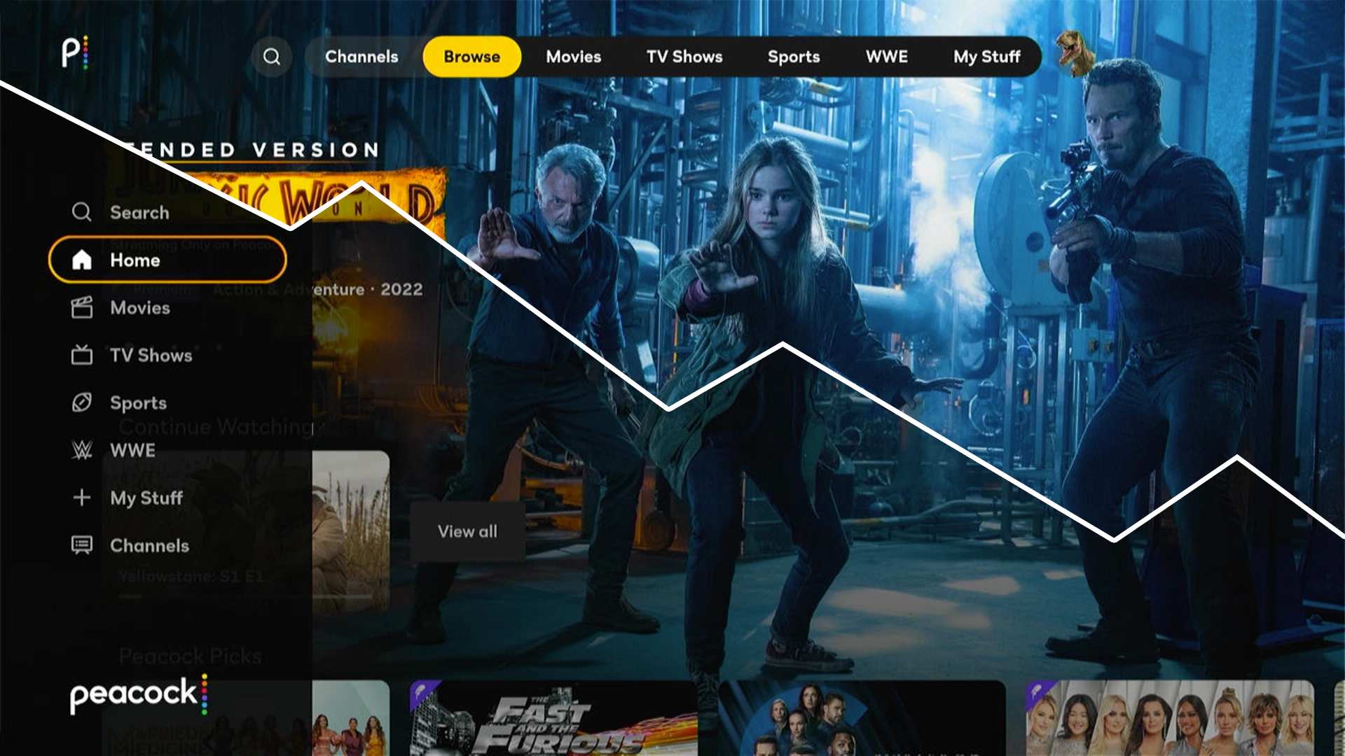
Left-hand navigation: The user’s choice
56% of the users we surveyed said they preferred streaming TV apps that use left-hand navigation to top navigation. But arguably more interesting, only 8% said they preferred top navigation. The other 36% said they had no preference at all when it came to primary navigation for streaming TV services.
The group who preferred left-hand navigation noted a greater familiarity with this navigation approach. Six of the eight primary paid streaming apps, which dominate viewers’ time spent with streaming TV services, are using left-hand navigation. Because of this, user perception for many of the people we surveyed is that left-hand nav is more standard. Even though top navigation is more prevalent, most users come in contact with left-hand navigation more frequently.
Pros
Quick menu access is more clearly understood: Users who prefer left-hand navigation also called out top navigation apps for being more difficult to navigate. They specifically referenced issues in relation to having to swipe repeatedly to get back to the main menu once scrolled down in a section. As we noted in the top nav area above, there are a lot of inconsistencies with how top nav apps are implemented, and it’s not surprising that many users aren’t aware of or don’t trust using the Menu/Back button shortcut to scroll back up.
Returning to the main menu in most left-hand navigation apps on the contrary is much easier for users to understand. If the user wants to get back to the main menu and is scrolled over to the right in the row they are currently in, they can simply apply the “up and over” method to scroll up or down a row they haven’t scrolled over in and then swipe over once to the left to get back to the menu. This is a more complex behavior than the Menu/Back action for top navigation, but it is much more obvious and easier for the user to discover.
The recommended way to support the “up and over” shortcut requires locking the focused state of each content row to the first item in each row. The disadvantage of this approach is that it is slightly less clear how far over in each row you have navigated.

An alternative is to not lock the focused state, but always return to the last item that was focused in the previous row instead of the item in the previous row that is directly above the currently focused item. This works but can be slightly disorienting.

If the focused state isn’t locked and the item directly above the currently focused item is selected in the previous row, the “up and over” shortcut isn’t as helpful. In some instances, the user would be better off just scrolling back over to the left in the currently active row.

We noted a decent amount of inconsistency in the way this works in the apps we reviewed. For this feature review, we also included the three recently converted left-hand navigation apps, NBA, Peacock, and Prime Video. Only three of the apps we tested (HBO Max, Netflix, and Peacock) properly support the “up and over” feature on all supported devices. Two of the apps we looked at (Disney+ and YES) don’t support the feature at all. The remaining five apps appear to intend to support the feature but fail to do so on some platforms.
Interestingly enough, the Menu/Back action also works to open the menu in most left-hand nav apps. Of the left-hand nav apps we looked at, only PBS did not support this behavior, and they supported it on one of the four platforms they are on.
If your app isn’t going to support the “up and over” shortcut, you should consider limiting the number of items per row to give the user a better opportunity to get back to the menu if they aren’t aware of the Menu/Back action. In our review, the average number of items per content row in left-hand navigation apps was just shy of 60. Disney+, one of the two apps that doesn’t support the “up and over” shortcut on any platform, was also one of the services with the highest max number of items per row. We counted one row in Disney+ with a whopping 175 items! CBS, an app that also does not support the “up and over” shortcut on Roku, was the only app with more items per row. There is at least one row of content in the CBS app (Latest Full Episodes) that has a seemingly infinite number of items.
Menu takes up less space when collapsed: Although it’s debatable how important space saving is in relation to the main menu, there is no denying that left-hand navigation takes up less space when it is not expanded, leaving more room to feature content or potentially make that content larger and more prominent.
Menu is always visible: In all but two left-hand nav app we tested, the closed, icon-only version of the menu is always present, providing a bread-crumb to the user of where they currently are in the app. Most top navigation apps on the other hand scroll their menus off with the content.
Access to the menu without losing your place: With most top nav apps, if the user wants to return to the main menu, they will lose their place in the current section. Most left-hand navigation apps are much more forgiving in this regard, allowing the user to get back to the menu while retaining their scroll position.
Cons
Menu is closed when initially opening the app: One drawback to left-hand navigation is that the main menu is minimized when first launching the app. This makes discovering the full features and content of the service more difficult on first launch. Of course it could be argued that the most important content in your app should be presented prominently in the Home section. With this perspective, perhaps having the menu closed shouldn’t be a major concern.
Mystery meat iconography: Another issue with left-hand nav is that the icons presented when the menu is minimized are not always clear. In most streaming TV apps, it’s easy to identify the Home, TV Shows, Movies, Search, and Settings icons. However, all bets are off with the remaining icons on most apps. Here are a few of the more obscure icons we observed in left-hand nav streaming apps.
- Star icon in Disney+: It would be easy to confuse this for a Favorites section. Instead this is the “Originals” section; an area to browse original Disney+ programming.
- Calendar icon in Netflix (Apple TV): One user we interviewed thought the calendar icon was a keyboard and wasn’t sure what it might represent. It’s the “New” section; an area presenting newly released content.
- Three lines and grid of nine dots icons in HBO Max: No one we interviewed was able to identify the three lines “Browse” and grid of nine dots “Hubs” icons in HBO Max. In this instance, the people we interviewed weren’t even sure what would be in these sections once the label was presented. We suspect these sections exist mainly as a last resort or to appease stakeholders.
Potentially more complex to implement: As mentioned in the top nav section, left-hand nav in and of itself isn’t necessarily more complex to implement, but it does encourage more advanced transitional animations that could make design and development time more extensive. See Netflix (all platforms) and Disney+ (Apple TV only) as examples of these transitional animations.
Menu access conflicts with featured carousels: A lot of streaming TV applications include featured content carousels at the top of their Home sections. This is true of both top and left-hand navigation based apps. For left-hand nav apps however, this can pose a problem. The issue is that carousels, especially those with several items work best when they are able to loop from the last item in the carousel back to the first and vice versa.
Being able to access the left-hand menu conflicts with this behavior. Some apps like Paramount+ and Prime Video work around this by only looping the carousel from the right when on the last item but not looping the carousel from the left so that a push from the first item in the carousel to the left will open the main menu.
Disney+ loops their carousel in both directions, but to achieve this behavior they hide their main menu completely when the app is first opened and at any point that the featured carousel is focused. This means that not even the iconographic breadcrumbs of other minimized left-hand menus are available on first launch. Disney+ does trigger the main menu to open from the carousel if the user selects the Menu/Back button on the remote, but we’ve already established that many users aren’t familiar with this action and are less likely to do it.
And not to completely get off on a tangent here, but it could be argued that featured carousels should be killed off completely anyway. There are many studies and posts including those from Nielsen Norman Group, Brad Frost, and CXL focused on the usability and value of carousels. These posts are based on web usage, but we suspect that we would see similar results for TV as well.
Put a different way, let’s look at Netflix for a moment. Netflix is notorious for throwing the kitchen sink at their users as far as the amount of content they present in their Home section. There are an endless number of posts focused on Netflix and the paradox of choice; the idea that too many choices overwhelms the user to the point where they can’t decide what to choose.
We get why a lot of these services rely on carousels. Odds are they don’t have Netflix’s coveted content recommendation engine which they value at over a billion dollars. But if Netflix can make their Home section work without a featured carousel, perhaps other streaming services can as well.

As a side note, I pretty much only open Disney+ to watch Marvel and Star Wars content, but as I write this there are currently fifteen items in their featured carousel, including shows I’ll never, ever watch like High School Musical The Musical The Series, Tangled Sing-Along, and Doc McStuffins. Now that multiple user profiles are more prevalent for these types of services, catch-all carousels make less and less sense.

Other inconsistencies
Menu/Back scroll up behavior: This one is a bit tricky. We noted earlier that for apps with top navigation it’s common that if users are scrolled down in content and select the Menu/Back button, they are scrolled back to the top of the view. This however is far less common with left-hand nav apps. Only two of the eight left-hand navigation apps we reviewed scrolled back to the top on all platforms. Two others exhibited inconsistent behavior across platforms.
But we also noted one pro of left-hand navigation is that users can quickly access the main menu without losing their place. Obviously this isn’t possible if the Menu/Back interaction returns to the top of the scroll view first.
Menu slides out on top of content vs pushing content over: Of the eight left-hand navigation apps we reviewed, only Plex pushes the content over to present the main menu instead of sliding out on top of the content. Although not included in our research group, the Tubi app—a somewhat popular free streaming app available on many of the platforms—and the Roku Channel app which is available on Roku, Samsung Smart TV, and compatible Amazon Fire TV devices also push the content over to present the main menu.
Sections load on focus vs on select: Another difference between left-hand nav and top nav is the sections load on focus vs select behavior. We noted that most apps with top nav activate their sections on focus and recommended following that behavior. Most left-hand navigation apps however require a select action before sections load. Of the left-hand nav apps we tested, only Plex loaded on focus, and it’s worth noting that Plex pushes the content over instead of sliding the menu out on top of the content like the other apps.
Recommendations for left-hand navigation main menus
If you choose to implement a left-hand navigation main menu in your app, we recommend the following behaviors.
The main menu should be closed when the app launches. It isn’t ideal that the main menu is closed on launch, but this is standard behavior for left-hand navigation and rightfully places the emphasis on the content.
Lock the focused state to the first item in each content row. Users who prefer left-hand navigation use an “up and over” shortcut to access the main menu. Even if your app supports accessing the menu via the Menu/Back button, which we also recommend, not all users know about this behavior and it’s challenging to teach. The “up and over” shortcut is easier for users to discover on their own.
Iconography should be as clear as possible. Ideally the user will rarely if ever need to use the main menu in your app. The most important content in your app should be presented in the Home section. Regardless, we should still strive for iconography that is as clear as possible for when the menu is minimized.
Consider eliminating the featured carousel and promote one featured item instead. This is likely to cause conflict with some stakeholders and relies on really knowing your user and tailoring the experience to them. However, usability of carousels is highly questionable. You are basically throwing the kitchen sink at your user in the hopes that they see something they like. But in reality users typically only ever see the first carousel item anyway. And as we noted above, in TV apps carousels cause some complications accessing the main menu for left-hand navigation.
When scrolled down in content, selecting Menu/Back should present the menu and retain your position in the app instead of scrolling back to the top of the current section. This is a difficult recommendation for us to make. We love the scroll to the top Menu/Back behavior, but consistency and the value of allowing the user to access the menu while retaining their place wins out here.
If you are really concerned about losing the scroll to top behavior, one thing we would suggest is that selecting the active section in the menu once it is open could scroll the user to the top of the section instead. This is admittedly less obvious and isn’t a standard behavior. The two most common behaviors we observed when selecting an active section in a left-hand navigation menu in a streaming TV app was that the menu simply closed or the entire section reloaded.
The main menu should slide out on top of content instead of pushing the content view to the right. Plex was the only app in our test group to not follow this behavior. Although this is primarily aesthetic in nature, we see little value or justification in breaking convention.
Sections should load on select instead of focus. Unlike top navigation, this is the expected behavior for left-hand navigation apps. The reason this works differently for left-hand nav is that the menu slides out on top of the section content, obscuring the content. It isn’t helpful and could potentially be confusing to load the content while the menu is still blocking the full content view. Instead, on select hide the menu and load the section.
The featured item in the Home section should be focused on launch, not the menu. We made this same recommendation for top navigation apps. The difference here is that this is the standard behavior for all left-hand navigation apps. Only the Yes app on Apple TV and Plex on a few of the platforms exhibited different behavior. The Yes app behavior is clearly a bug and we suspect Plex’s is as well.
Top or left-hand nav? Which should you choose?
Some on our team strongly prefer top nav, finding it clearer and easier to use. However, when making design decisions, our personal preferences should inform our decisions but hold little weight. Both navigation approaches have their pros and cons and neither is clearly better than the other. If you want to go with the approach that users are most familiar with, tend to prefer, and that has a more obvious approach to return to the menu, left-hand navigation is the clear choice.
Just keep in mind that left-hand nav can be a bit more complicated to implement if you want to integrate more complex slide out transitions like Netflix and Disney+. And regardless of which approach you choose, make sure you leave time in your schedule to get the details right. Hopefully we’ve provided some valuable guidance that will help you make either nav option the best they can be.