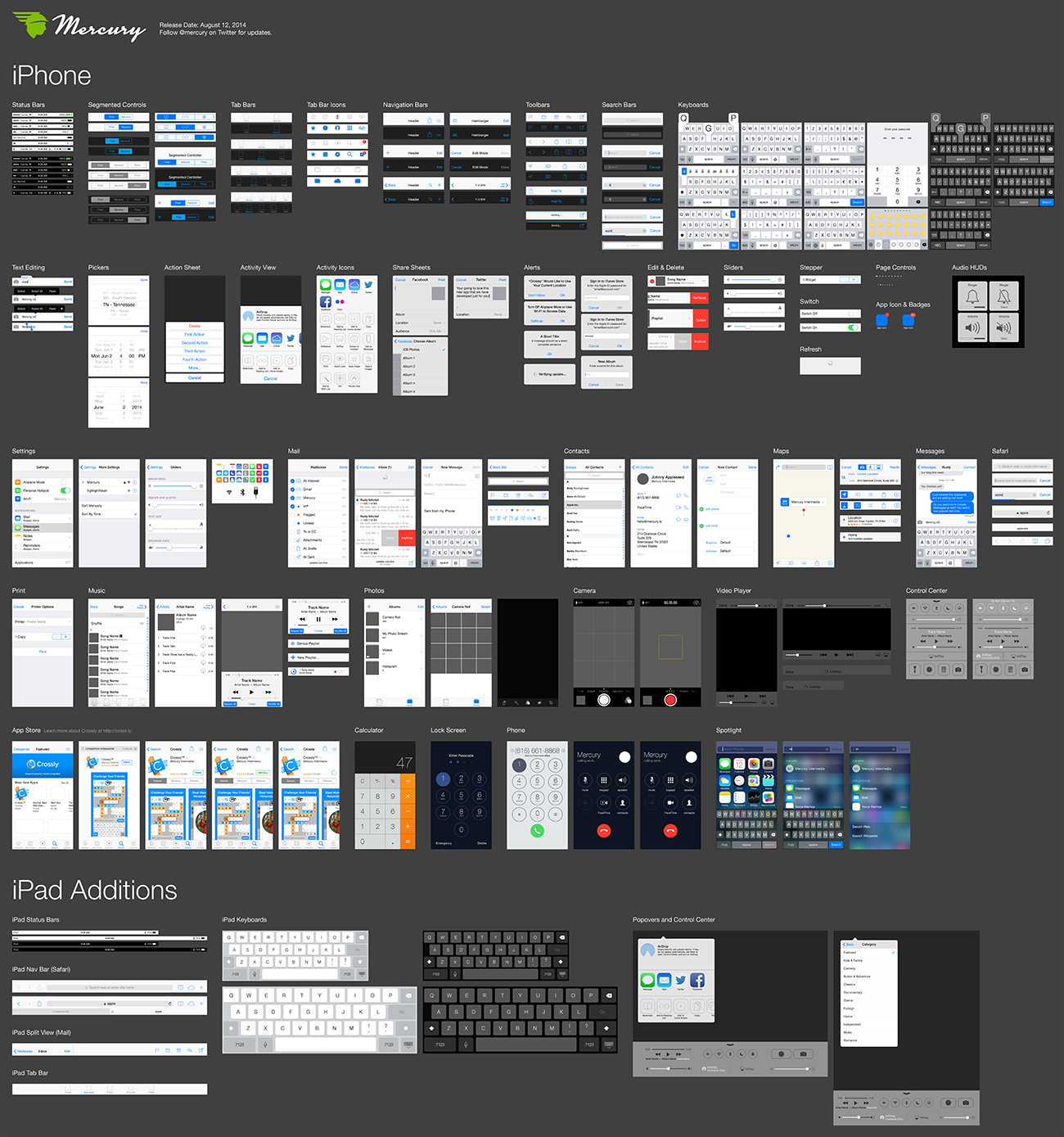
Back in 2009, Mercury released an Illustrator file of vector-based iPhone UI elements. We originally created this resource because we found ourselves needing a place to quickly grab vector versions of iPhone buttons, bars, and stock elements when creating our designs.
Of course a lot has changed in iOS UI since 2009, especially in the past year. We have continued to create internal UI resources but haven’t slowed down long enough to share an updated UI file until now.
[CUE DRAMATIC LIGHTING AND SOUND EFFECTS.]
If you are here strictly to download the file and bolt, we can appreciate that you are busy and won’t hold it against you. A download link appears at the bottom of this post. However, if you are interested in reading a bit more about why we created an Illustrator version of these assets and a little info about the file itself, please continue.
When we released our previous file in 2009, the main question we received was why we would go to the trouble to create an Illustrator version of the iPhone UI elements. We addressed this at the time in a post titled “Why build iPhone app mockups in vector format?” There is even a nice note about the then rumored imminent introduction of higher resolution screens and how we hoped our use of vector files would help us once they were announced. (It helped A LOT.)
But I wanted to quickly address why we continue to use Illustrator. To be clear, I’m not trying to convert any of you to Illustrator or wage another war on which design tool is best. Let’s be honest, neither Illustrator nor Photoshop were created with the specific needs of UI designers in mind. Though Mercury’s design team has many years of experience with both Illustrator and Photoshop, we find Illustrator to be the fastest way for us to be productive and create precise software mockups.
Multiple Artboards, reusable Symbols, and the ability to quickly select an Object or series of Objects and drag to duplicate are just a few of the things that make Illustrator an efficient and powerful tool for us. However, Illustrator is not without its faults. Raster effects like blurring leave a lot to be desired and exporting of final raster assets sometimes — maddeningly — result in pixel shifting, regardless of pixel precision and sub-pixel avoidance.
When it comes right down to it, if you are more comfortable or feel more productive in Photoshop or newer up-and-coming tools like Sketch, that’s awesome. The folks at Teehan+Lax have you covered with similar UI kits for Photoshop and Sketch that you can download from their site.
About the file
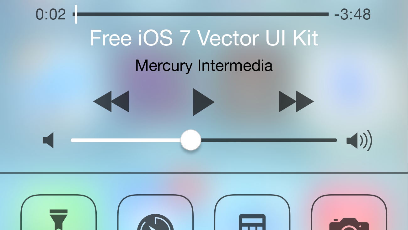
I won’t bore you with the intricate details of our design team laboring away like loving Keebler Elves to put this all together, but know that every element in the file was redrawn as editable vector objects from the original iOS 7 screenshots.
Though the majority of the items in the document are based on iPhone, this file includes a few iPad specific items as well. We decided not to break iPhone and iPad apart since there is so much redundancy. It seemed best to keep everything conveniently located within a single file. We also expect that the separation between iPhone and iPad will continue to soften over time. Apple is pushing for developers to focus on more flexible layouts and if rumors hold true, the days of additional screen sizes for iOS hardware are fast approaching.
This file is compatible with Adobe Illustrator CC and newer and was created at retina size for iPhone 5 and newer. Below are a few features you might appreciate.
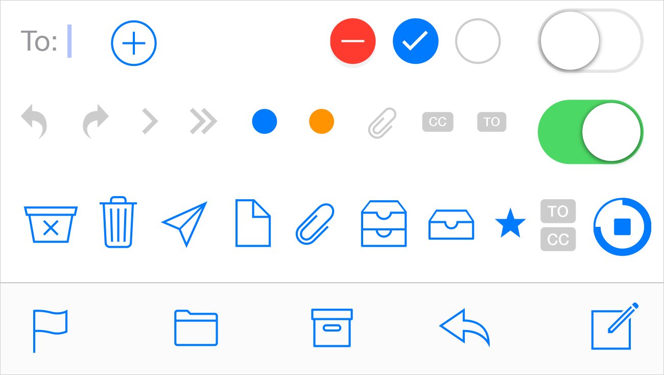
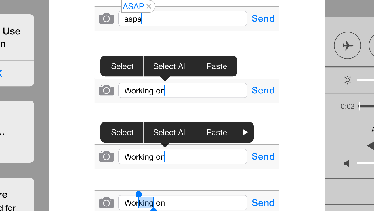
Pixel Grid Alignment: We’ve focused on making this file pixel-perfect. Everything is on a pixel, when possible, so that all assets are sharp and clean. This includes using 1px tall/wide boxes rather than strokes for divider lines and turning on raster view when redrawing icons to make sure things are as accurate as possible. Also, we’ve purposely turned “Align New Objects to Pixel Grid” off in the Transform palette because it wreaks havoc on corner radii and icons. We recommend that you do the same.
Grouping: We’ve grouped like elements together so that it’s easy for you to grab an asset and drag it to your file or do isolated editing. We’ve also grouped transparent boxes with icons and other objects that may not sit on a pixel so that they don’t get misaligned.
Global Swatches: If you look in the swatches window, you’ll notice a number of global swatches (the ones with the little white triangles in the corners). If you edit any one of these swatches (the key color, for example), it will change all the comps to reflect that change. We hope that you’ll find this handy for theming elements based on your app’s unique color palette.
Symbols: Though we tried to keep symbols to a minimum, you’ll notice that we did use a few 9-sliced symbols for things like keyboard buttons.
And now, the moment you’ve been waiting for…
Saying thanks
We hope that you find this kit useful and look forward to seeing what you create with it. Please feel free to share with us via email. We would appreciate your help in getting the word out as well. If you have design friends who might find this resource useful, pass it along and link back to us on your social network of choice.
If you want to go a step further to say thanks and like word games, check out Mercury’s recently released competitive crossword game, Crossly. It’s structured like a traditional newspaper based crossword puzzle, but plays like Letterpress or Words with Friends. You can even add me as a friend on Game Center and challenge me to a game (my username is seekbus). If you enjoy the game, be sure to leave us a review in the App Store or shoot us a message to let us know.
