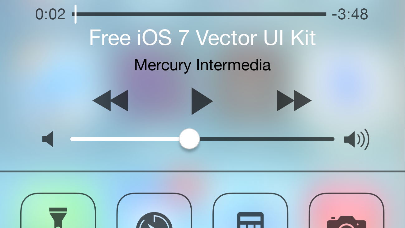
We’re back with an iOS 8 update to our popular iOS Illustrator UI kit! Last month we released our free vector UI kit for iOS 7. We have a history of offering such resources, but we were admittedly late to the game. We assumed the iOS 7 document would be useful until iOS 8 was released and by your responses, we were correct. We’re thrilled that so many of you have found it helpful.
However, we also expected the iOS 7 UI kit would make a future update to iOS 8 trivial. And though iOS 7’s UI kit was a good foundation, the update to iOS 8 was NOT trivial.
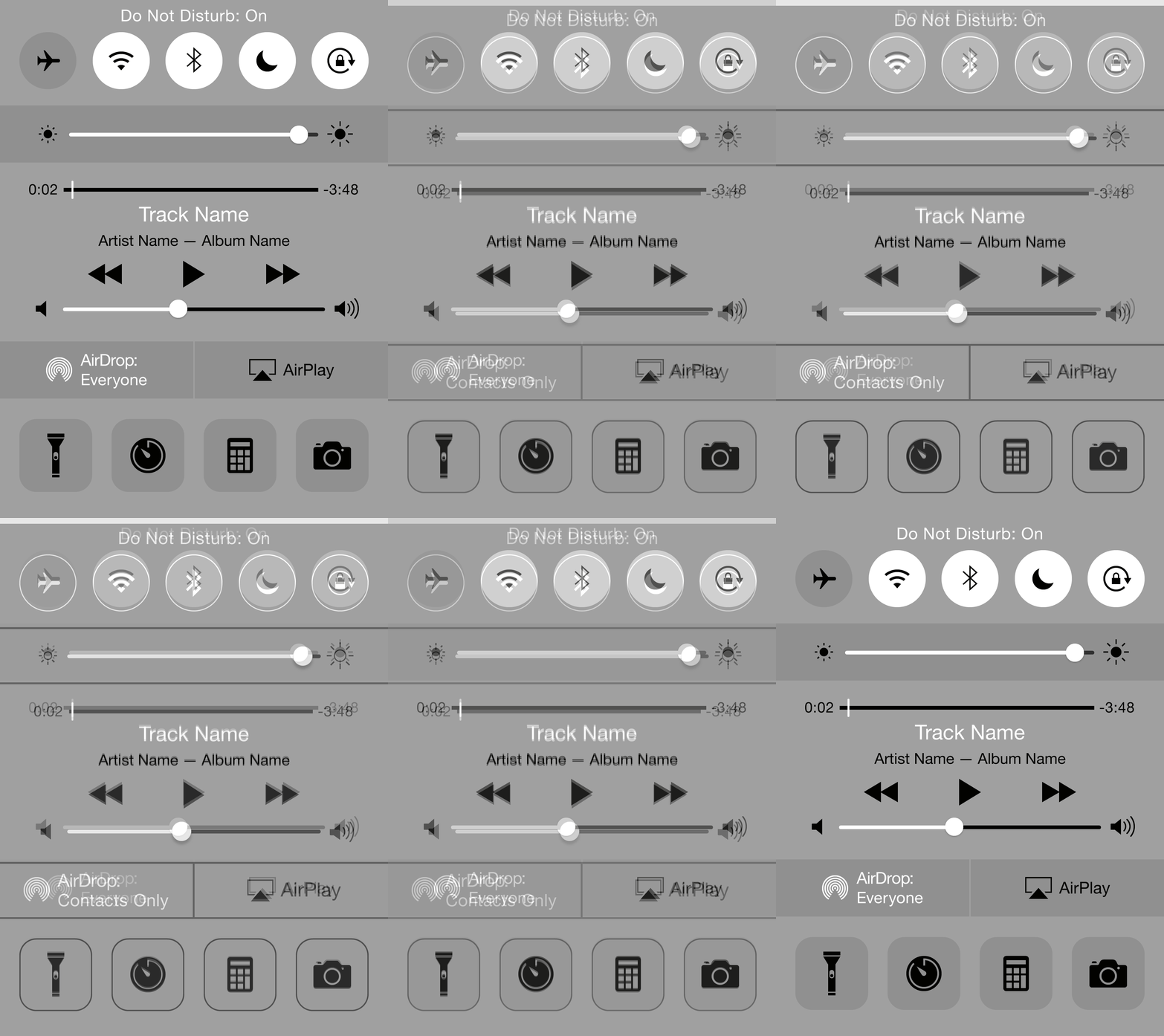
Subtle, yet extensive UI changes
Apple’s UI changes from iOS 7 to iOS 8 are often subtle, yet incredibly extensive. Spacing, positioning, and font sizes and weights were liberally tweaked and adjusted. To our surprise, almost every icon was redrawn as well. Even the lowly chevron and back arrow were reworked!
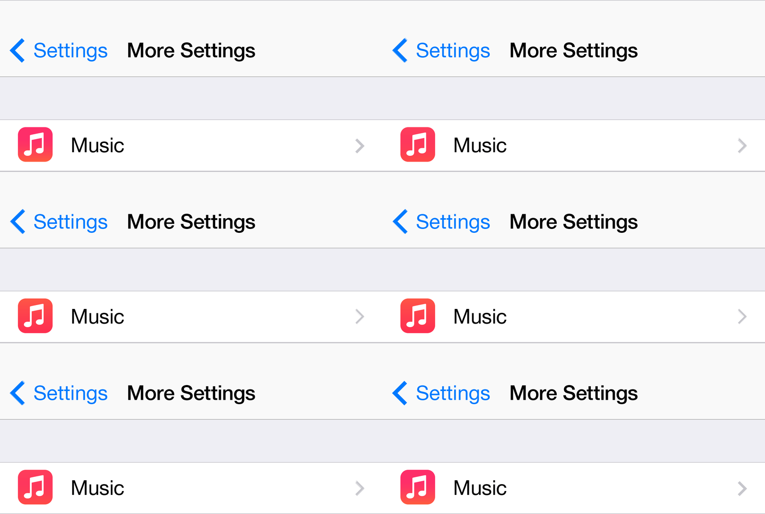
It’s easy to understand why Apple changed the spacing and positioning adjustments as they continue to add to the dimensions of their growing iOS device families, and the days of relying on fixed positions for iOS apps fades away. As to why Apple chose to redraw so many of the icons, we can only speculate. The most logical guess is the addition of new 3x assets. Scaling from existing 1x assets may not have been ideal because of reduced detail and fidelity. While scaling 2x assets up by 150% isn’t desirable unless dimensions of all pixel aligned elements are set at even measurements upfront to avoid sub-pixel blurring.

Additions
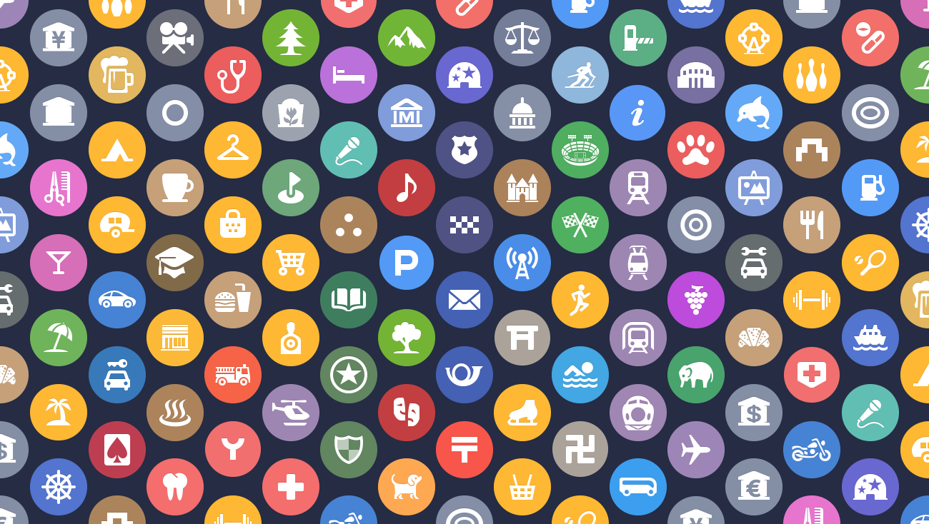
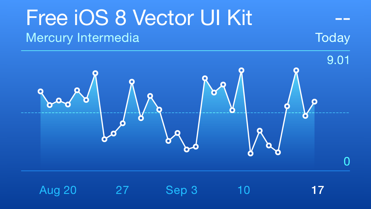
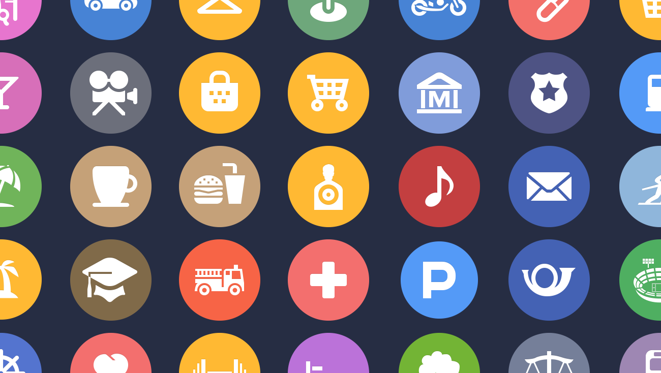
Along with the more subtle changes made in this UI kit, we have also included many of the new iOS 8 additions such as the QuickType bar, expandable notification banners, the Messages radial UI, Health charts and icons, Photo editing tools, and new Camera modes. As an added bonus, we even recreated Apple’s complete set of weather icons and redrew as many of the new Spotlight Map category icons as we could locate. (If you are interested in how we tracked down the Spotlight category icons, let me know and I’ll put together another post.) Feel free to reach out if there is anything we excluded that would be useful for mockup or educational purposes.
What we learned
We’ve already touched on how expansive the changes were in iOS 8, and that was by far our biggest lesson here. I admire Apple’s attention to detail in making so many refinements that most users might never even notice. It’s the type of craftsmanship that is often overlooked or dismissed as too time consuming and unnecessary, but these types of details add up and are important.
We are always excited to see how Apple is approaching their UI and iconography and the approaches they take in creating various elements and objects as well. Personally, I always enjoy evaluating how objects are created that are outside of my normal approach. With this in mind, it was fun to deconstruct the new Family Sharing iCloud icon and see how objects were layered and blended. As small as it is, I also enjoyed recreating the color wheel stroked circle icon used to represent Color options in the new Photo editing suite. And one of the more unexpected discoveries was how Apple composites multiple text layers with various blending effects and opacities to achieve readable text across all six of the various colored Health charts.

Times they are a changin’
So where do we go from here? I’ve been a designer for almost twenty years, originally starting as a print designer. iOS’s print level layout control and pixel precision has always been one of the major differentiators between it and Android. My love for that level of precision and control is what first drew me to iOS and why I preferred it to the more web-centric approach of Android.
But times have changed, and we will all have to change as well. For those of us who have also designed for Android, we may wax nostalgically for the good old days, but these changes shouldn’t cause any major concerns or complications. For those of you who have managed to remain iOS only: good luck, and don’t resist. It isn’t as painful as it might at first appear. It is still possible to create beautiful fluid layouts you can be proud of.
One last thing
We had several discussions and debates over which iPhone resolution and screen size to mockup for moving forward. Several designers have questioned whether it might be best to move back to designing at 1x sizes since mockups at 1x will be easier than 2x to reliably scale to 3x. This is typically the approach we take for Android, designing at medium density and then scaling from there. But the concept of 1x for iOS is going away. Perhaps our opinion will change as we continue to design apps for iOS 8, but for now, we are moving forward with 2x, and we plan to continue to create mockups for now at the smaller 640×1136 iPhone 5/5s size instead of moving to the larger 750×1334 iPhone 6 dimensions.
About the file
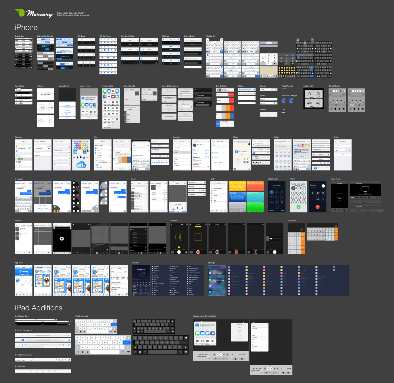
This file is compatible with Adobe Illustrator CC and newer. Here are a few features you might appreciate:
Pixel Grid Alignment: We’ve focused on making this file pixel-perfect. Everything is on a pixel, when possible, so that all assets are sharp and clean. This includes using 1px tall/wide boxes rather than strokes for divider lines and turning on raster view when redrawing icons to make sure things are as accurate as possible. Also, we’ve purposely turned “Align New Objects to Pixel Grid” off in the Transform palette because it wreaks havoc on corner radii and icons. We recommend that you do the same.
Grouping: We’ve grouped like elements together so that it’s easy for you to grab an asset and drag it to your file or do isolated editing. We’ve also grouped transparent boxes with icons and other objects that may not sit on a pixel so that they don’t get misaligned.
Global Swatches: If you look in the swatches window, you’ll notice a number of global swatches (the ones with the little white triangles in the corners). If you edit any one of these swatches (the key color, for example), it will change all the comps to reflect that change. We hope that you’ll find this handy for theming elements based on your app’s unique color palette.
Symbols: Though we tried to keep symbols to a minimum, you’ll notice that we did use a few 9-sliced symbols for things like keyboard buttons.
Saying thanks
We hope that you find this kit useful and look forward to seeing what you create with it. Please feel free to share with us via email. We would appreciate your help in getting the word out as well. If you have design friends who might find this resource useful, pass it along and link back to us on your social network of choice.
If you want to go a step further to say thanks and like word games, check out Mercury’s recently released competitive crossword game, Crossly. It’s structured like a traditional newspaper based crossword puzzle, but plays like Letterpress or Words with Friends. You can even add me as a friend on Game Center and challenge me to a game (my username is seekbus). If you enjoy the game, be sure to leave us a review in the App Store or shoot us a message to let us know.
