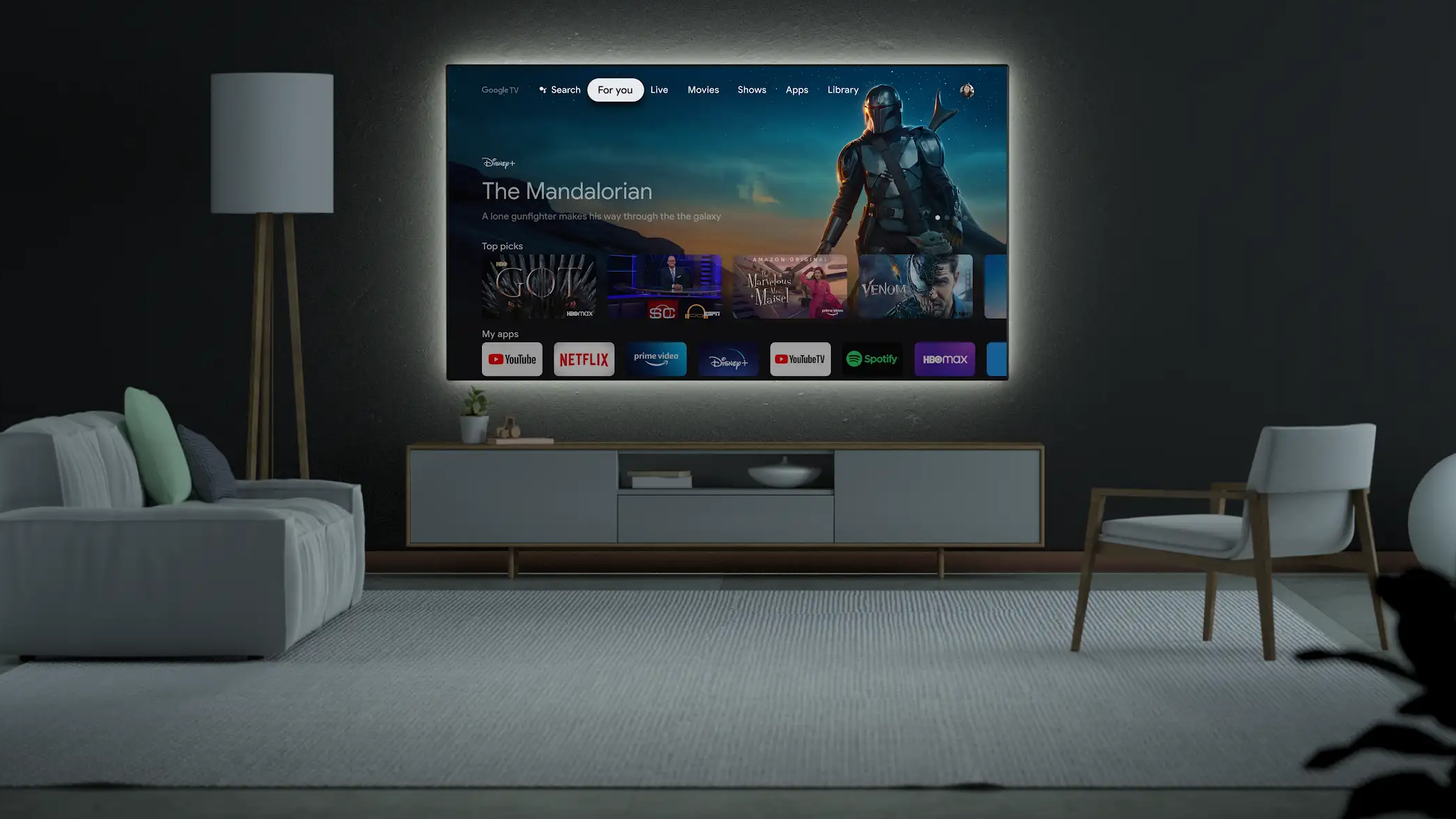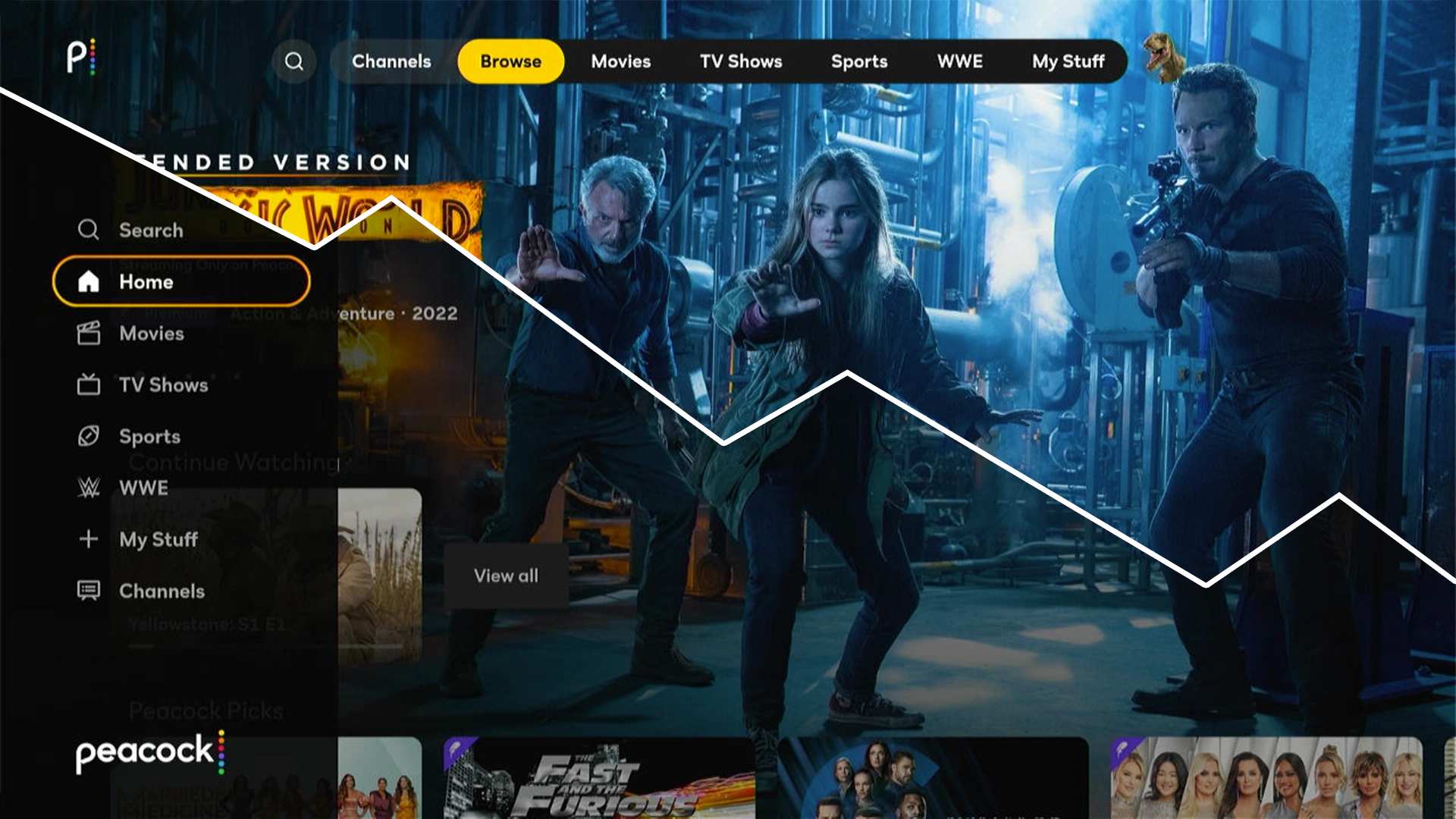
Streaming video applications have become one of the primary ways people watch video content. This applies across personal mobile devices, tablets, computers, and also the larger, often shared, TV experience. Although basic guidelines for designing streaming app experiences for TV are widely available, there are many important details which can impact the overall experience.
In a series of upcoming posts, we’ll examine the current state of streaming TV platforms and applications as well as explore some often overlooked design details that separate great streaming apps from the competition.
Platform fragmentation
One thing is certain, people expect their favorite streaming services and network content to be available wherever they choose to stream. This presents a challenge to content owners tasked with supporting an extensive number of smart devices, streaming platforms, and gaming devices with nuanced differences in interaction and controls. And it presents a challenge to those of us who design and develop software for these platforms to ensure that we understand and really nail the details.
Unlike mobile devices or computers, where people tend to be loyal to a single platform or brand, it’s not uncommon for people to use multiple streaming TV platforms in their home. According to Leichtman Research Group’s Connected TVs 2022 report — part of their nineteenth annual study on TVs in the US — 66% of all TV households have multiple types of connected TV devices, with a mean average of 3.9 devices per TV household. For example, a household might stream content via Samsung Smart TV or LG’s WebOS TV platform in one room while accessing the same streaming service on a Roku, Fire TV, Android TV, or Apple TV device or a game system like Xbox or Playstation in another. These platforms have many minor navigation and behavioral differences, but share a lot of the same rules and design language. It’s the small inconsistencies that tend to cause user confusion.
Using multiple streaming services
To further complicate matters, because of the siloed nature of network TV and streaming services, many people use several streaming apps. A recent survey from Nielsen’s April 2022 State of Play report found that 58% of Americans use three or more different paid streaming services. And this doesn’t include network TV streaming apps accessed by those with linear live TV subscriptions. It’s honestly all a bit overwhelming.

Using several different applications to address the same task is fairly unusual. Typically people choose one web browser, email client, music player, or Podcast app for their desired platform and stick with it. If their chosen web browser handles a particular task unusually or something doesn’t work quite as expected, they learn to work around it, live with it, or find a better solution.
People are often not afforded this luxury with streaming apps. If a viewer wants to stream a popular new show or movie, it’s not uncommon for it to only be available “for free” via a single streaming service. This adds another layer of complication where users must learn to not only navigate multiple platforms but multiple streaming services as well, each with slight differences in navigation patterns and controls.
Streaming platform growth
According to Nielsen’s June 2022 Gauge report, live broadcast and cable TV is still currently the primary way people watch video content, accounting for over 57% of time spent across all video platforms. However, time spent with streaming video services grew 23.5% year-over-year to 33.7%. And it’s worth noting that Nielsen only counts paid streaming services in their streaming numbers. It’s unclear how they account for the streaming apps associated with traditional broadcast and cable networks, which would further increase the overall amount of time viewers spend accessing streaming apps for their video watching experience.

Netflix CEO Reed Hastings recently predicted in their second-quarter earnings report that linear TV’s dominance will end in the next five to ten years. This is almost certainly the direction things are heading. But if linear TV is to continue to be replaced with multiple streaming apps, we need to strive for a better, more consistent experience.
Consistency undervalued
Consistency is unfortunately not always valued in design. Design portfolio social networks like Dribbble and Behance are structured such that interfaces that are unique and different are often what are most celebrated. These types of explorations are useful and can be exciting, but we shouldn’t forget that in real world scenarios that consider the larger ecosystem the product will reside in, the unique and different are often not in the user’s best interest. As designers, we should look to innovate when the standard approach is lacking and needs improvement, but a lot of the time the best thing we can do to be a good citizen of the ecosystems our products reside on and make our user’s experience frictionless and enjoyable is to follow the guidelines and standards of the platform.
Fragmentation and divergence are where a lot of the problems and challenges arise in TV interface design. Although it’s a bit illogical, sometimes if all other similar apps follow the standard approach, it can even be in the user’s best interest for us to follow a slightly unusual system standard rather than attempt to “fix” the problem with a better solution. Obviously there are exceptions to this, but there is value in what we like to refer to as “shared obfuscation”, the idea that regardless of how unclear or confusing a UI is, if all similar services work the same, the user has no choice but to learn the behavior.

Platform design guidelines and the basics
Before we dive into the details of designing the streaming TV app experience, it is important that we are all familiar with the design guidelines for the various streaming platforms and understand the basics. According to the video analytics company Conviva, in their Q1 2022 State of Streaming report, the top six streaming TV platforms in the US are Roku (30.78%), Fire TV (16.45%), Samsung (13.23%), Android TV (7.24%), LG (6.97%), and Apple TV (4.87%). Below are links to the various design guidelines for each platform with some quick thoughts.

Roku
One thing you might notice about Roku’s design guidelines is an emphasis on creating experiences that are performant on varying levels of hardware. It’s clear that Roku understands that some of their currently supported hardware is underpowered. Unfortunately the burden is on the design and development teams to throttle animations, video resolution, etc. to make sure the app is able to load and perform to a certain standard on the platform.

Fire TV
Design and User Experience Guidelines for Fire TV
Amazon’s Fire TV Design and User Experience Guidelines are fairly high-level and touch on general principles of designing for a 10-foot experience as well as topics like resolution, overscan and safe zone, color, typography, navigation and input, and screen patterns.

Samsung Smart TV
Design Guidelines for Samsung Smart TV
Samsung offers a well organized, high-level overview of designing for TV while addressing a few Samsung platform specific recommendations.

Android TV
Google’s Android TV design guidelines are arguably the most organized and strike a great balance between covering the basics and touching on subjects specific to the Android TV experience.

LG TV
We love this note on consistency from the webOS TV guidelines: “Your app will play an important part in keeping the overall webOS experience consistent and enjoyable to use.”

Apple TV
Apple recently adjusted their Human Interface Guidelines so that there are high-level guidelines for each of the hardware types they support and then all of the foundations, patterns, components, inputs, and technologies sections are broken out to address the various platforms where applicable. One unique thing Apple promotes in their tvOS overview is encouragement to support unique tvOS system features such as integration with their TV app, SharePlay, the tvOS Top Shelf, and TV Provider Authentication. There is a ton of useful information available if you dig in to the various sections of the HIG, but be prepared to wade through a lot of things that may not be applicable to TV.
Apple also provides a series of tvOS Design Resources that includes a Sketch Library, Design Templates, Parallax Previewer, and more.
Beyond the platform guidelines it’s also important to be familiar with the basics of TV safe area, navigation paradigms, color, font size recommendations, etc. The various platform guidelines cover many of these things, but we also found the following posts to be good introductions to designing for TV:
- Rethinking User Interface Design for the TV Platform by Pascal Potvin
- Designing for Television — TV Ui design by Molly Lafferty
- TV Guidelines: A quick kick-off on designing for Television Experiences by Andrea Pacheco
- 7 Core Principles of TV Design by Mete Polat

Wrapping up
Fortunately, most of these services share a lot of similarities, but the small differences and inconsistencies between apps and from platform to platform that are encountered along the path to the simple task of watching streaming video can still trip users up and make for a less than ideal user experience. It’s these app and platform differences and inconsistencies that we will explore in this series.
To this end, we recently examined twenty-five streaming applications including all of the main paid streaming services, the major networks, several sports apps, and a few outliers across the top six streaming platforms in the US (Roku, Fire TV, Samsung, Android TV, LG, and Apple TV) and conducted a series of informal user interviews and surveys in an effort to better understand the current state of streaming apps.
Our first deep dive post with research and recommendations around top or left-hand main menu navigation is available now. And in a series of future posts, we’ll present our findings and share our thoughts and insights on focused states, exiting TV applications, search, gated vs non-gated subscription services, video player controls and interactions, ad insertion rules, and more. It’s our hope that if we can better identify and document the problems and inconsistencies and define clearer best practices, we can make the streaming TV experience better for everyone.


