Designing great streaming TV apps, Pt 2: Top or left navigation
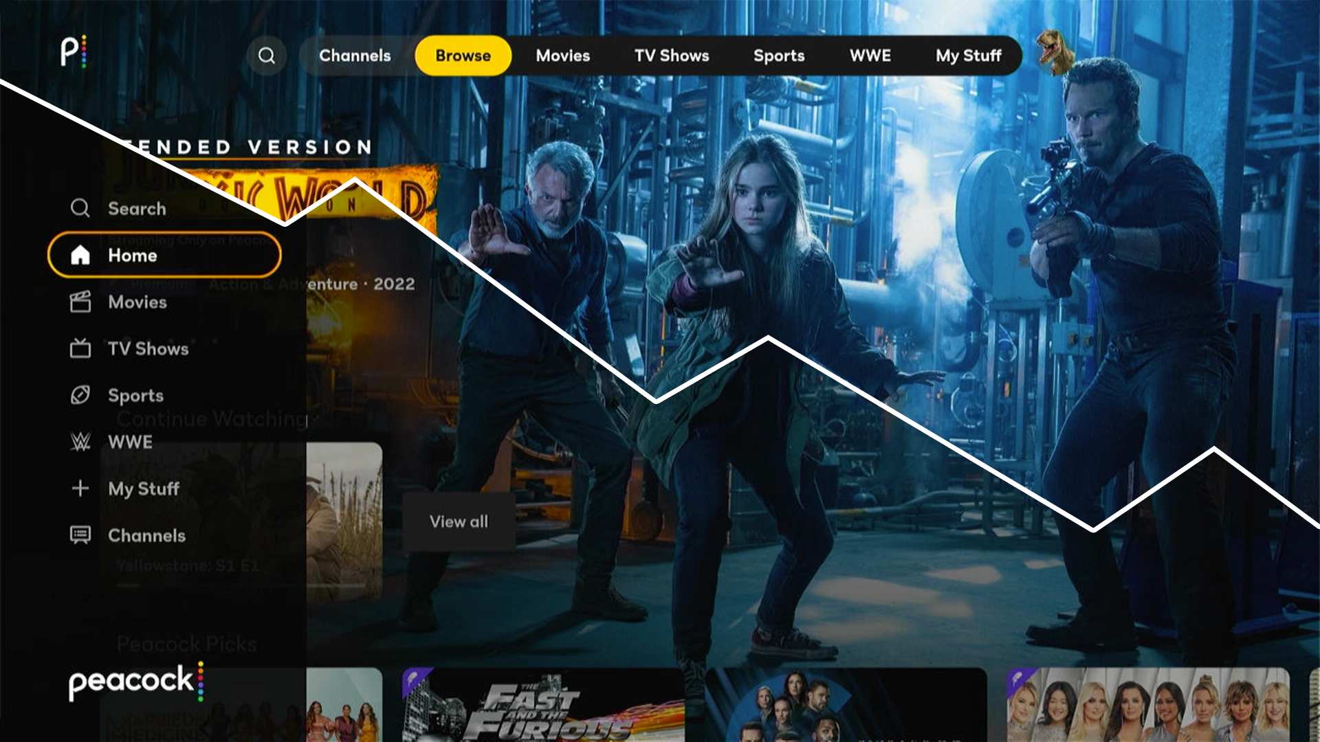
In part two of our series on designing great streaming TV apps, we explore the pros and cons of top and left-hand main menu navigation.
In part two of our series on designing great streaming TV apps, we explore the pros and cons of top and left-hand main menu navigation.

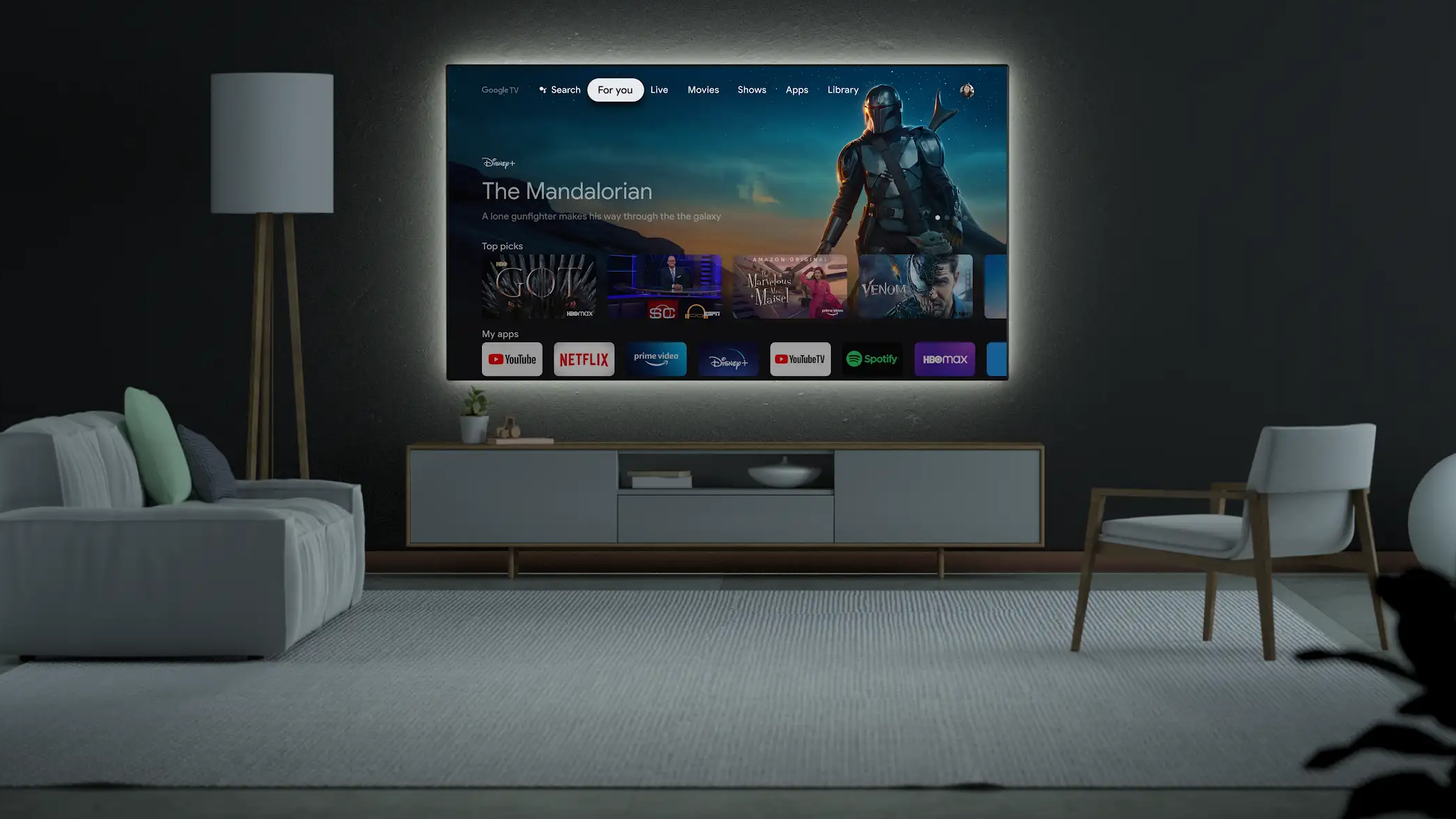
Because people often use several streaming TV apps across multiple platforms, design inconsistencies create an even greater strain on users.

Concepts demonstrating what could be possible if Apple TV allowed custom interactive screensavers to be included with an installed app.

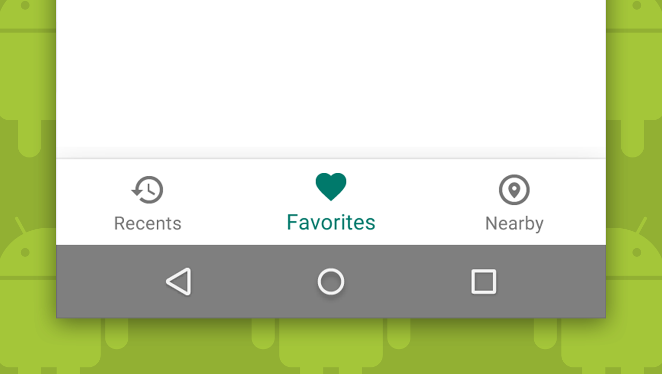
Despite Google’s history of advising against bottom navigation, they recently added it to their material design guidelines as a primary navigation pattern.

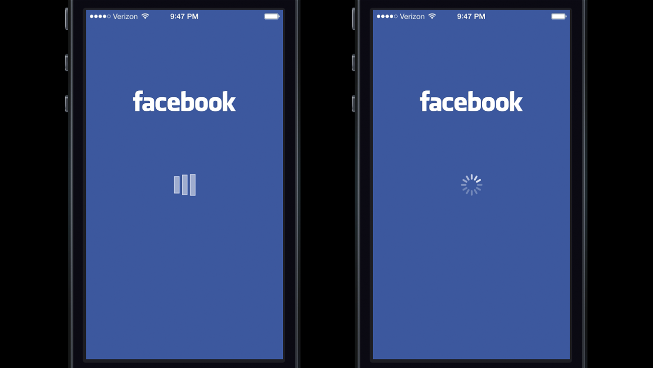
A review of how users respond to active and passive waiting, along with a story of how Facebook adjusted their loading animation to offload blame to the operating system.

How can we help you?